


Perfect Analytics for Online Schools
TABLE OF CONTENTS
Profit.Store

310
The largest number of our customers are founders of online schools, so we decided to share our expertise in this market segment. So what are the pain points in an online school business, and what solutions does our end-to-end analytics tool offer? We tell you how to optimize your activities and increase the efficiency of processes with solid data.
Introduction
It so happened that at the beginning of the year, businesses plan their downloads, and set goals and sales plans for the year. And, as a rule, "unhealthy businesses" make plans based on some of their assumptions or inner feelings. At the same time, "healthy businesses" always rely on numbers and plan the year based on this and understand what actions they need to take to make these plans come true.
Absolute and relative indicators
But in order for the unit economy to be implemented, it is necessary to include in the plan both absolute and relative indicators, which we actually implemented in our ideal analytics. And now in more detail.
On the first dashboard, we have indicators divided into three categories. On the first dashboard, we display the required number of payments and expenses. Also, based on the revenue and the number of payments, we derive the percentage of the delivered plan. That is, in the upper part we have the numbers that we actually received, and below them is the percentage that is the result - by what percentage the plan was fulfilled for the period. We also derive a return on investment (ROMI), percentage of plan execution (ROAS), and cost of attracting a paying customer (Customer Acquisition Cost) based on relative indicators. We also display planned conversions, such as Click to pay, conversion from leads to payment, planned registrations, number of leads, and number of targeted leads. That is, we show the actual numbers that are available now but for the selected period.
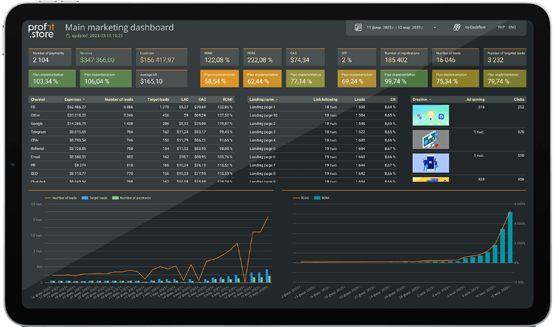
On the dashboard, we can see immediately how we are moving, where we are moving and whether we are moving to where we aimed at at the beginning of the month.
Calculation example
Let's say, in January, we spend, invest in advertising 10 thousand dollars, get certain results in registrations for this money, maybe already in the lead, and immediately some part buys.
But the $10,000 we invested in January actually pays off with some lag. This is called the deal cycle.
If you have a person who buys immediately after registration or after leaving an application, that is good, there are no problems with this. But if, let's say, it is about some study abroad, when parents send their children to study in England or Canada, there, as a rule, the agreement cycle is from three months to nine months. And here it is necessary to consider which investment in which traffic channel brought a real sale. It is quite difficult. And that's why there are different mechanics of evaluating these results. Now we have the P&L model included, correct? Let's give one more example, and from this, it will be clear what P&L is, and what the dreaded word cash flow is.
Real customer case
Now, I give an example from a real case of our client. We have costs for lead generation in January. They started getting money from leads partly in January, partly in February, but most of it in February. So, at the meeting, the financial director says: dear marketers, don't do as much as you did in January because you had a lot of expenses there but little profit, and do as you did in February, where you have almost no expenses, but we received much more money.
So, CFOs, you count cash flow: you take a clear period, how much money was spent, how much was received, without any reference to who actually brings this money. Regarding P&L traffic payback, as marketers calculate, everything we got in February should be counted against our spending in January. So, we will get the return on traffic really based on the costs that were in January, and this is the P&L model. That is, this dashboard is for marketers and financiers, i.e. accountants. And for all managers - all those who care about money, about setting plans, executing plans, this dashboard is for all these employees. They can use it with different display modes.
The central part of our dashboard is solid tables. But you can add costs, look at the cost of attracting a lead, add the cost of attracting a paying customer. And we immediately start rebuilding the table, taking into account additional indicators.
That is, you can analyze data on the performance of traffic channels according to the indicators you need. Marketing director, financial, operational, commercial, general - everyone adjusts for himself as he wants. This table reflects the sources from which certain clients and registrations came. That is, data is automatically pulled here from your Facebook, Instagram, Google advertising account - any advertising systems that have some kind of interface. They are pulled automatically loaded into this table. But in addition, here we have traffic sources without such an interface where you can go and see the data. For example, SEO costs or hosting costs for bloggers and some partners. These are more complex advertising systems, but you buy traffic in them, place with bloggers or pump your Instagram, and this data is pulled here. But how is it organized? Let's reveal this secret.
There are advertising services with and without advertising offices. Well, therefore, we cannot go somewhere to import data. It is clear from the advertising offices, through the recording of the service, we write a data import system, receive this data, automate the import so that the dashboard always has fresh, new, up-to-date data.
Where we cannot do so, we provide the most user-friendly tables for accumulating data for our clients. That is, these are tables where you write the expense item, the amount of the expense, and the mandatory reference to the date, so that all expenses always follow the dates on the dashboards so that there is a clear reference. Thus, you accumulate this data. Any marketing expense is recorded in the dashboards during calculation. ROMI is necessarily used, because we count ROMI not only because we imported from the advertising cabinet, but also because we take into account all real marketing costs.
Table of landing pages
The following table is focused on landing pages, that is, those landing pages, those registration pages or product purchase pages that are already in your system.
They are also connected automatically, this happens through the LMS, CMS system, or through Google Analytics, or advertising cabinets. That is, those links to which you receive traffic are recorded and displayed here.
There are also the number of clicks and applications on these landing pages and, of course, the conversion. The most effective landing pages in this table will be at the top if sorted by the conversion rate indicator, which is the most important in evaluating effectiveness. You need to always look at it and monitor its growth, because it is the conversion rate of landing pages that directly affects the number of leads, the quality of leads, and, of course, money in the classroom.
Table - a performance of creatives
The following table is a performance from creatives. We tabulate real previews of banners used in advertisements. Of course, this is all fully automated. Well, we can display metrics on it - from display to return on investment. Anything. That is, here is the dream of many marketers and business owners, when a person clicks on an advertisement after the first click and eventually buys it. And it is possible to track automatically with the help of such a system in which advertisements result in the greatest number of sales.
Thus, if you buy, say, registrations on Facebook for 3-4 dollars, and you think that it is expensive and you need to turn it off, and those registrations are for 1 dollar or 50 cents - that's where you need to pour. And you see this data, say, in the Facebook advertising room, and the target specialist actually makes a decision about which banners to keep and which to disable. With the help of this system, you can see those advertisements and creatives that result in sales.
So here, we have laid out the entire funnel from impression to payment, considering the dynamic indicators from each table.
In the lower part - graphs. We have separated the absolute and relative figures into two different graphs. Now you can add indicators to these graphs to analyze not only in numbers, but also on a graph with the effect of changing indicators retrospectively for the selected period. Here you are in the dynamics, you will be able to compare some increases, let's say, costs or increases the number of leads depending on how the ROMI increases and the payback. And see what periods you had in both relative and absolute terms.
Thus, if you increase expenses in June-July, it will give a kind of surge in August. Well, for sales not to sink in June-July, it may make sense to launch some long-running campaign in May in advance or to attract people to some content project, which without additional costs in July, when people there go on vacation, will bring in additional sales. Thus, your income will be more stable, and this indicator will not decrease. That is, this is knowledge that, in retrospect, gives you an understanding of how you should act in the future, and this is very cool.
And we have the same schedule according to relative indicators. We derive, of course, ROMI and ROAS, and also add a conversion indicator here, such as Lead to Pay, Conversion Sale and from lead to payment. Now everything becomes clearly clear, what depends on what, and you can study this data already in such a plane.
Let's make a short summary of the first dashboard. We have at the top the main indicators that a business owner needs to monitor - the number of sales, payments, turnover and plan/actual comparison. In the middle part of the dashboard there is an advertising funnel by sources, by landing pages and by creatives in the section of all the indicators that are necessary for analysis. At the bottom there are graphs where you can track trends, add, upload absolutely all indicators to this graph, comparing and tracking different trends.
Our next dashboard is focused specifically on marketing, on tracking the effectiveness and understanding of your marketing. We combined advertising services with advertising offices and advertising services without advertising offices in one dashboard. At the same time, display all performance indicators, taking into account those that are in the advertising cabinet and those that are not. That is, it is again SEO, bloggers and so on. We have all the sources of traffic, all these channels on one dashboard.
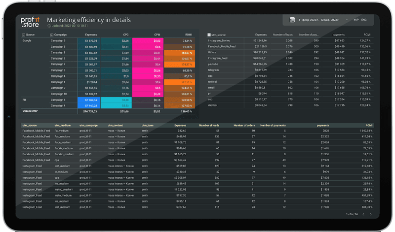
However it is important that advertising services with advertising cabinets have a clear structure. So, we repeat this clear structure in the dashboard.
An ad campaign will be broken down into ad groups, and ad groups will be broken down into ads. And if you've ever run ads on Facebook or Google, you remember this source. This is actually targeted advertising on Facebook, Instagram or contextual or something else.
Often, our clients have dozens of business managers and different advertising offices with which different traffic specialists work. It's important for you as a marketer or business owner to understand which target specialist and traffic team is attracting the highest quality traffic that leads to more sales. And that's why it's very convenient to do it here. All sources and advertising offices are collected on one dashboard.
Here we can already add all additional parameters. Everything that is in the advertising office, everything that is in the analytics service, everything that is in the CRM system. We derive all these parameters to evaluate our marketing activities as efficiently as possible. That is, the entire customer journey from the display of the advertisement, the click, the cost per thousand impressions, the so-called CPM, conversions to the landing page, registrations, let's say how many of them went to the webinar or some intermediate targeted actions, they are visible here. And their result is orders, purchases and money received from money spent, money for advertising shows, that is, payback. And, again, here you can add them and remove unnecessary indicators to build the sample of indicators you need. And what is valuable and cool is the ability to download the assembled table in a Google spreadsheet, the assembled dashboard, in two clicks.
Using the UTM builder
There is a very convenient UTM tag builder where you can assemble a link already placed correctly for you - just copy and paste the desired advertisements into the desired email messages at any stage of the chatbot and so on.
Considering that you have UTM tags and mark all your traffic, every activity in Internet marketing is tracked. And this tracking is displayed on our dashboard in the list of channels that do not have advertising cabinets. They are displayed according to the structure of UTM tags, that is, UTM Source, UTM Medium, UTM Campaign, Content and Term - all the important information you recorded in the UTM tag will be fully revealed in the structure on this graph.
That is, even if you, say, do some large-scale content project and launch advertising, for example, at a dozen bloggers, and in your UTM Source there will be bloggers, then different, different companies of some kind, and in UTM Terms, in some last one, you specify the label exactly of this activity, and then you want to collect data about this particular activity, you do not select Source and Campaign and other UTM tags, but only the Terms value of the activity that interests you. Then you get data on all placements specifically for this project, and you can see the entire breakdown by clicks, registrations, orders, sales, and so on, and as a result by revenue, and you can evaluate how successful this particular marketing activity was. It is very cool and convenient.
That is, you see end-to-end analytics for each email sent, end-to-end analytics for each posted publication on a media resource, Performance Chatbot and so on, that is, everything on one dashboard.
From the incoming traffic, plus or minus, it is clear how to analyze it. Let's see now how this inbound traffic will convert into leads and sales, how we will track it and on which dashboard we will be able to see it.
We have a webinar funnel based on the statuses of deals from the CRM system. And now attention, magic. Since we introduced the webinar feature in the CRM system, by selecting a specific webinar, we can see everything that is happening in the system in terms of webinars directly. That is, we can see from registration to payment within one specific webinar, we can see data about the registration webinar, how many came to the webinar, how many were more than 30 minutes, how many reached the end, how many clicked the button, how many applications, sales, what was the amount of a specific webinar. This is really cool because you can track both auto-webinar funnels by a certain attribute, and if you're doing live webinars, every webinar room you create will track all the leads and all the users that went through it.
Accordingly, it is very convenient to build analytics and you can track which funnels bring the most money. This allows you to understand what content to create, what types of marketing activities are more interesting, which funnels work better in general - webinars, lead magnets with test access to the course, through a course for beginners or through consultation or in some other way. It will be possible to see everything on this dashboard and, accordingly, make the right management decisions again. Well, and in the context of a specific webinar, we can also see all the agreements and statuses of these agreements corresponding to it, on a specific visualization of the statuses of agreements for a specific webinar.
If we see that for a certain webinar, for example, there are a lot of applications, but in fact people get stuck on the status (“thinking” there, “made an appointment for a consultation” there, or “received an offer”), then perhaps it is worth thinking about how not only to make the webinar itself interesting, but also to strengthen the selling part, because people on emotions may leave the application, but do not reach the sale.
This kind of analytics gives just a huge amount of insights you can implement and improve your marketing. So you clearly understand where marketing is not perfected and where sales are not perfected.
And we tried to display this opportunity to see at what stage the subsidence exists in graphs and tables. We've developed two dashboards for key marketing and sales performance metrics.
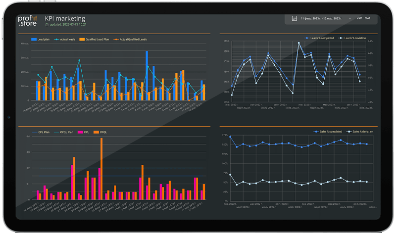
Marketing KPIs in leads
We derived marketing KPIs in leads, targeted leads and cost of leads and targeted leads. Of course, the amount of revenue and payback is also a marketing task, but it is mediocre, because there is a great influence, and probably even more influence, the sales manager's sales.
But the number of leads, their quality and their value are what marketing is responsible for. And we displayed it in separate dashboards so that the owner can decide whether his team is working effectively or not, and even calculate the salary and bonus parts for the marketing director, for the marketer, for the funnel specialist, from the traffic, based on this data.
For any period, we choose and look at the percentage of completion and what is happening with the main KPIs in marketing itself. That is, both the marketer and the business owner can come in at any moment and see how much money he will get there as a result. Yes, one will count how much he will receive, and the other will count how much he will pay.
Next is the sales dashboard, which shows the effectiveness of sales managers. And here we also tried to make the system as transparent and convenient as possible, which can be viewed by department or each manager to understand at what stage or in which human factor there are problems with the implementation of the plan, how to calculate the salaries of these people and, in general, how effective employees and the tools we use.
And that's not all. We would like online schools to start tracking the effectiveness of sales scripts. So we implemented this thing and now we have departments, manager and scripts in the dashboard sections. That is, the same label as we had on webinars, now the same branch is entered specifically for scripts. In the script section, you can see all the effectiveness of the sails.
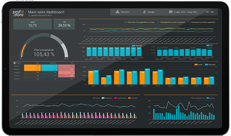
And now managers and heads of departments can simply run constant A/B testing of two, three, five scripts at the same time and then see which scripts actually work better and which can be used more often. To track them, in CRM it is enough to simply assign some label, some tag to the deal, because this deal was processed according to such a script, and then we will see it here in the graph.
We also have a general schedule like this in the upper left corner - this is the execution of the plan both for the department and for a specific manager. It is clear that there is a story about LTV, that is, all its upsells without ad spend, this is an important KPI. We also see leads, targeted leads, invoices issued, payments, all this in dynamics. There are still conversations for more than ten seconds, how much we had to pay and the load on the manager. Conversations for more than ten seconds are, in principle, the primary indicator of a manager's performance. This is to cut off all the conversations and select only the target ones and build the right conversions from them. Because if the manager does not have enough of them, then there is only a marketing problem, because they pour low-quality leads who do not pick up the phone, who are uncomfortable talking. And at the same time, this is an indicator of the manager's work, that he pretends to work there, as if he makes 100 calls a day, but really communicates for ten seconds. This is not very efficient work, and here you can immediately see how to make decisions.
Conclusion
So, let's summarize. In every business that thinks about scaling, systematization, and reporting, there is still a huge human factor problem. With every business or business process, an employee can happen.
However, you should not have an intermediate stage between importing the figures and preparing the annual report, based on which you act further. Our full-fledged analytics system just imports the data, automates the import, and displays all the solid numbers on the dashboards you work and make decisions on.
SHARE

OTHER ARTICLES BY THIS AUTHOR
Get the most exciting news first!
Expert articles, interviews with entrepreneurs and CEOs, research, analytics, and service reviews: be up to date with business and technology news and trends. Subscribe to the newsletter!
By clicking “Subscribe” you agree to Privacy Policy and consent using your contact data for newsletter purposes
OR FOLLOW ON:
