


A comprehensive guide to Google Looker (Data Studio): a feature overview and setup instructions

TABLE OF CONTENTS
Profit.Store

411
Google Looker (formerly known as Data Studio) is a free data analysis and visualisation tool. This service does not collect metrics and parameters, but allows you to easily and efficiently download them from various sources. Google Looker Studio is particularly useful in business and can be used for a wide range of tasks including financial analysis, human resource management, sales funnel visualisation, marketing effectiveness analysis and departmental performance analysis.
In addition, Google Looker (formerly Data Studio) allows you to analyse a wide range of statistics, and you can easily import this data from a variety of sources, including Google Sheets.
Today, Google Looker Studio has a Pro version that can be purchased for $9.
Google Looker Studio Pro includes:
- Data connectors and file import
- Data exploration and reporting
- Share reports and data sources
- Manage and back up your Looker Studio content with Google Cloud
- Share and collaborate with team workspaces
- Work with data on the go with the Looker Studio mobile app
- Analyse faster with fast filters and personalised report links
- Get support with your existing cloud support package
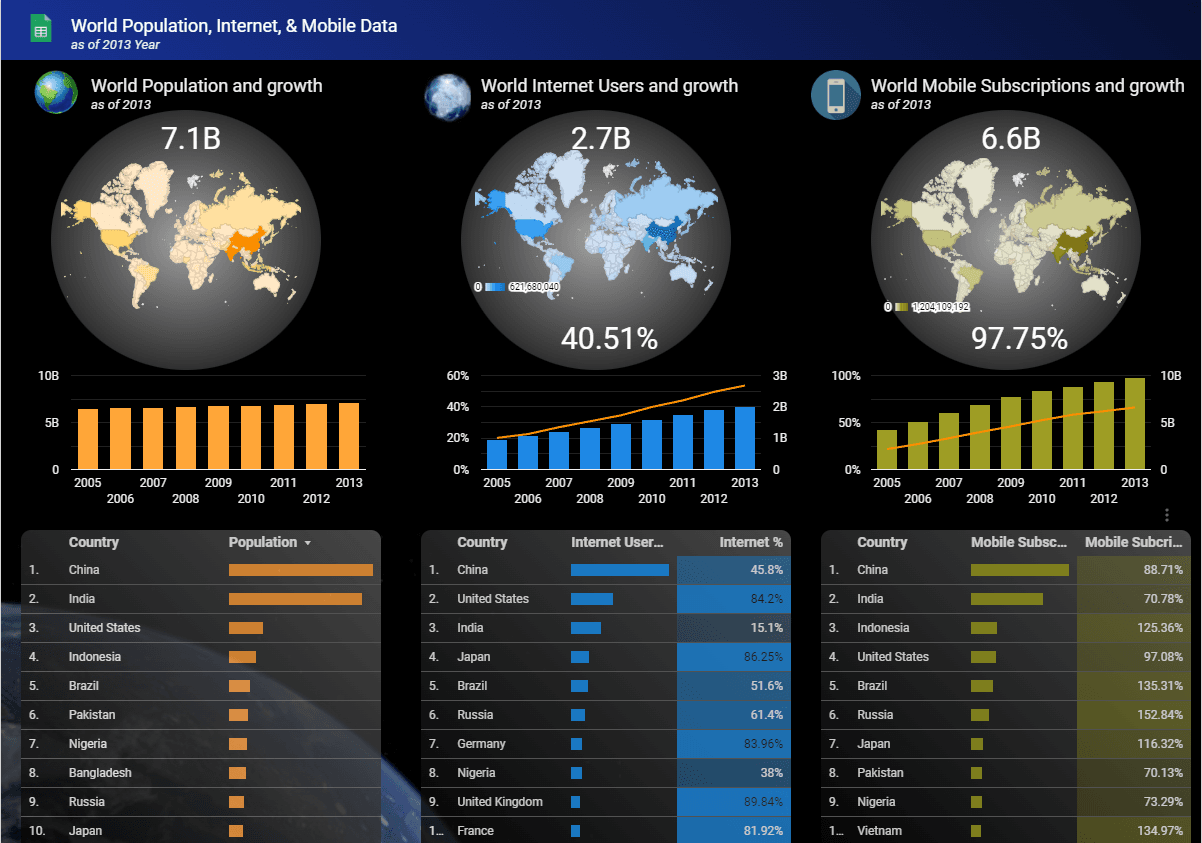
(For example, this is what a visualisation of world population data uploaded from Google Sheets to Google Looker (formerly Data Studio) looks like)
Despite the wide range of possible applications, Google Looker (formerly Data Studio) is actually a popular tool, with the main area of use being marketing. This is due to the variety of report templates available, most of which are specifically designed for marketers. It also integrates with popular data sources such as Google Analytics, Google Ads, YouTube Analytics, Facebook and many others. In this context, Google Looker is an extremely useful and powerful tool for optimising strategies and choosing the best online marketing solutions.
The benefits of Google Looker (formerly Data Studio) for marketers
Marketers are actively working with a large amount of data coming from various sources such as web analytics systems, advertising platforms, social networks, call tracking services and CRM, ERP, LMS, CMS. Each of these tools provides its own reports and interfaces for analysis. However, it is difficult to work efficiently when switching between different platforms, and to get a complete picture you need a single view that combines all this data.
Google Looker (formerly Data Studio) allows you to combine data from different sources and bring it all together in one report.
| Advantages |
|---|

|
|
|
|
|
|
|
|
|
|
|
|
|
|
|
|
|
|
|
| Disadvantages |
|---|

|
|
|
Scenarios for using Google Looker
Google Looker (formerly Data Studio) is used to solve a variety of marketing tasks.
What this tool allows:
- Automate reporting to clients on paid traffic channels.
- Create interactive dashboards to monitor the status of advertising campaigns.
- Build an end-to-end analytics system.
- Get a complete picture of marketing effectiveness and compare results across channels - from targeted and contextual advertising to email and content marketing.
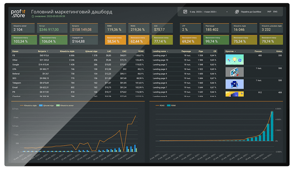
(For example, there's a Google Ads e-commerce report like this in the Google Looker (formerly Data Studio) template gallery)
Getting started with Google Looker (formerly Data Studio)
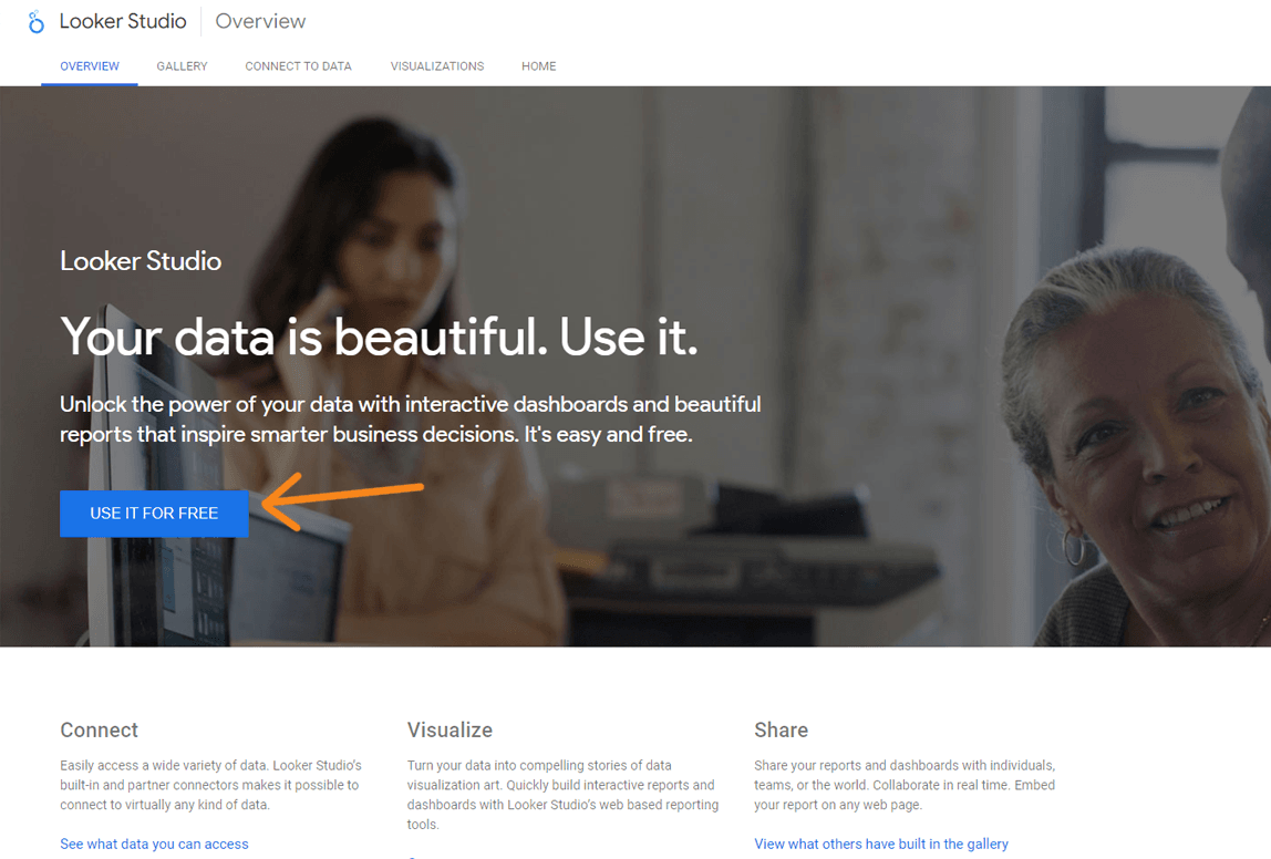
To create your first report, go to the Data Studio website, click the "Use it for free" button and sign in with your Google Account.
(Start working in Google Looker (formerly Data Studio))
Important: Your Google account must have access to the required data sources, otherwise you will not be able to create a report.
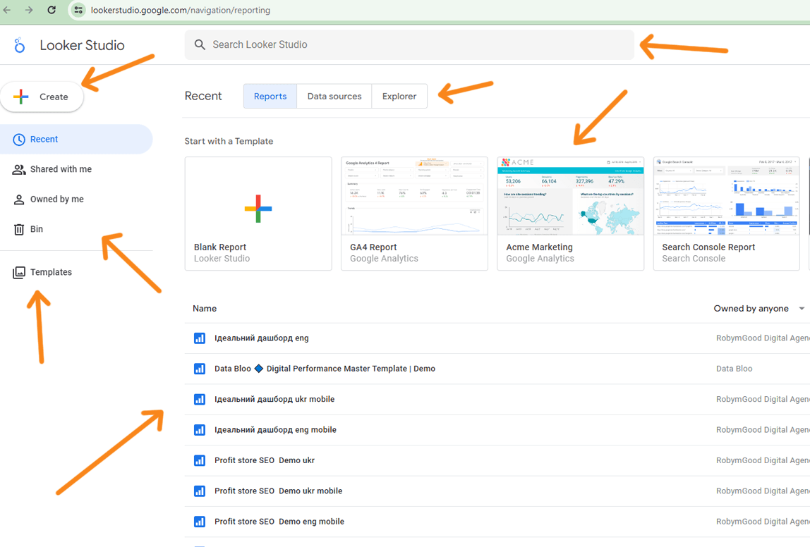
After logging in, you will be taken to the Google Looker (formerly Data Studio) interface, which consists of the following components
- The top menu with the 'Reports', 'Data Sources' and 'Workspace' tabs. These will display the relevant tools once they have been created.
- Side menu to switch between Recent, Available, Custom and Remote tools - Reports, Sources, Areas.
- Create buttons - one click brings up a menu for creating a report, data source and workspace.
- Strings for searching files in Google Looker (formerly Data Studio).
- Template Galleries. Click the up and down arrows to open the full catalogue.
- The Templates link in the side menu also opens a gallery of templates.
- The list of tools. When you first log in, this field will be empty. Later you will find reports, data sources and workspaces here.
- Groups of elements in the top right corner. From left to right: help and tutorials, account settings, switching between Google Marketing Platforms services, account management.
(Google Looker (formerly Data Studio) is very similar to Google Drive in terms of interface, so it should be intuitive)
There are two ways to start working on a report:
- Click the Create → Report button;
- click on a blank report in the template gallery.
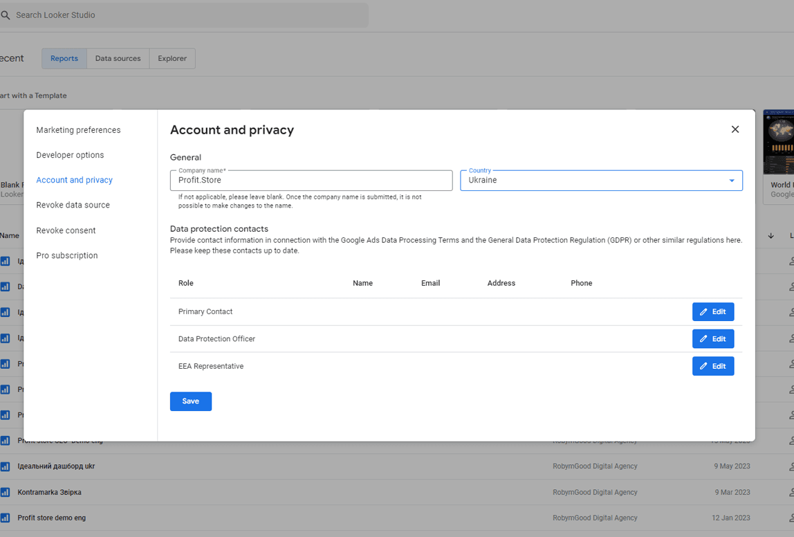
If you are signing in to Google Lookup with a new account, you will first need to set up your account and your subscription terms.
Enter your country, company name, and accept the terms and conditions. You can leave the Company field blank.
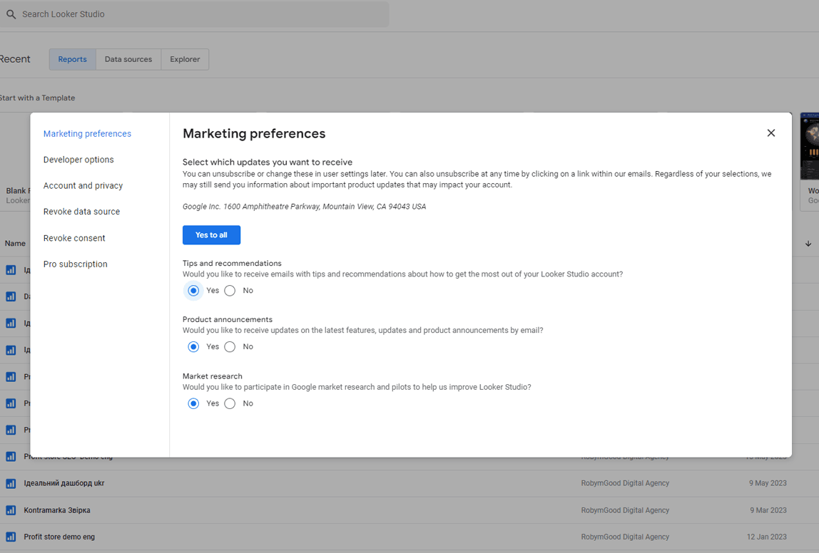
Choose which newsletters you would like to receive from Google Looker (formerly Data Studio). You can unsubscribe from any of the newsletters.
After clicking the Create Report button and opening the dashboard editing interface, the system will prompt you to connect a data source. This is the first step in the report creation process and allows you to select a data source.
Once you have selected a data source, you can configure the connection settings, select the required tables or data sources, and start building your report based on this data.
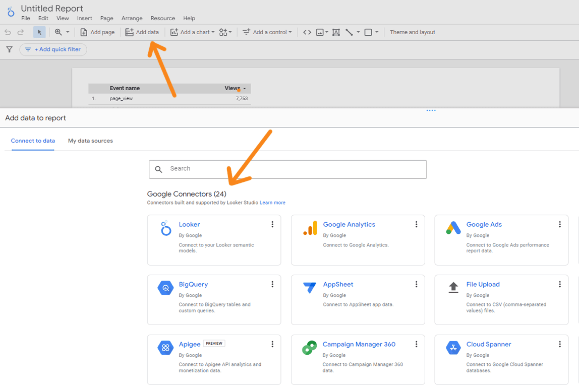
Connecting data sources with connectors
The services and systems from which we pull data for our reports in Google Looker (formerly Data Studio) are called data sources. These sources can be different platforms, such as Google Analytics, Google Ads, Facebook Ads and others. Special tools called script connectors are used to enable the exchange of data between Data Studio and the sources.
Google Looker (formerly Data Studio) has 471 connectors for connecting different data sources. Of these, 18 are official Google connectors that are available for free. The other 453 connectors are developed by third-party developers and may have terms of use that impose some cost, usually related to data volume or functionality.
This means that you can choose the connectors that best suit your project based on cost and functionality.
You can connect using free Google connectors:
- Google Analytics
- Google Ads
- Google Tables
- BigQuery
- Google Cloud SQL for MySQL
- Search Console
- YouTube Analytics
- Other Google services
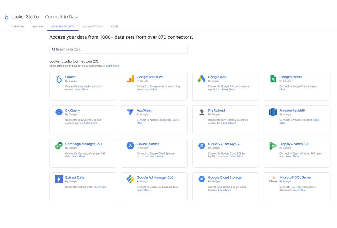
(Free connectors for Google Looker (formerly Data Studio))
Options from third-party developers:
- Elama
- Facebook Ads
- Airtable
- Asana
- Zoho CRM
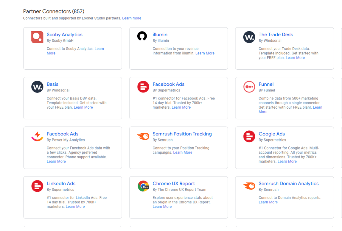
(Third-party Google Looker (formerly Data Studio) connectors)
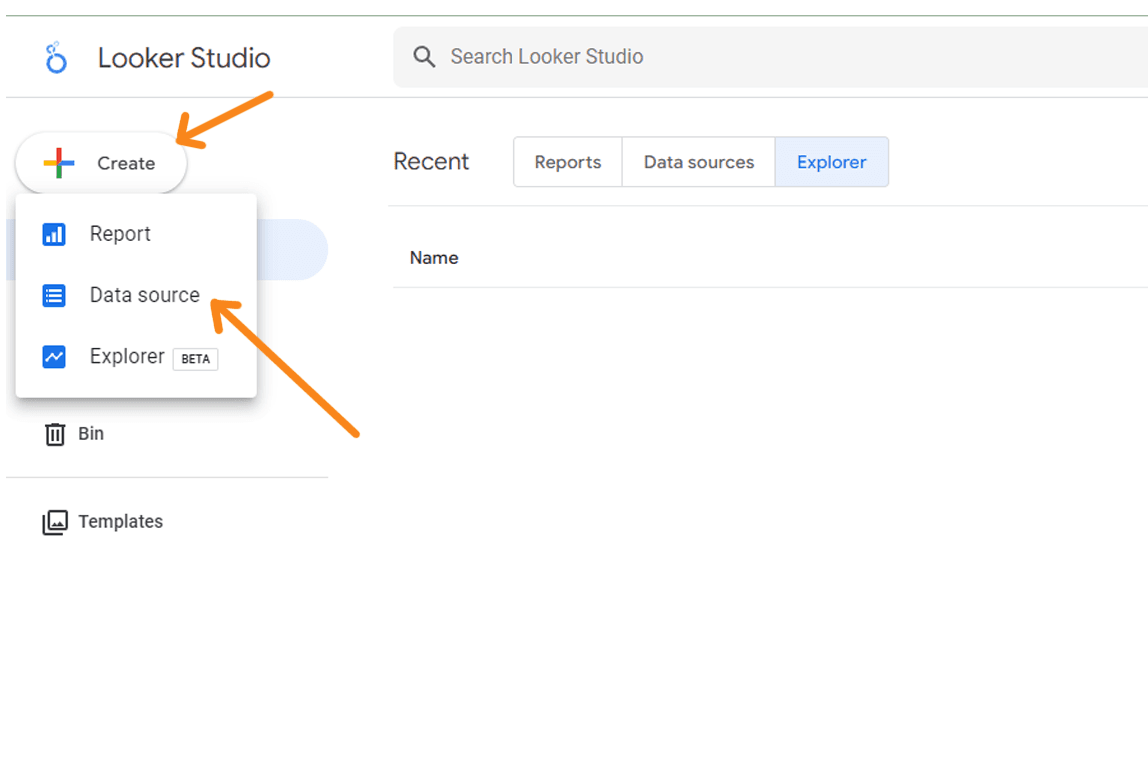
There are two ways to connect a data source via a connector: when creating a report and from the Google Looker (formerly Data Studio) homepage.
In the first case, a new report is created and the service immediately offers to connect the source.
In the second case, click on the New button on the Data Studio homepage and select the Data Source item.
(Click to open the connector catalogue)
The procedure is identical. Select the required connector from the list and click on it. We will use Google Analytics as an example for this process. The first time you connect to a connector, you may be asked to authenticate.
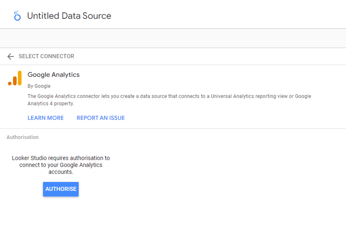
(To pass authorisation, click 'Allow' and continue)
In the Google Analytics connector settings, you will need to select an account, resource and view. The process may be different for other sources.
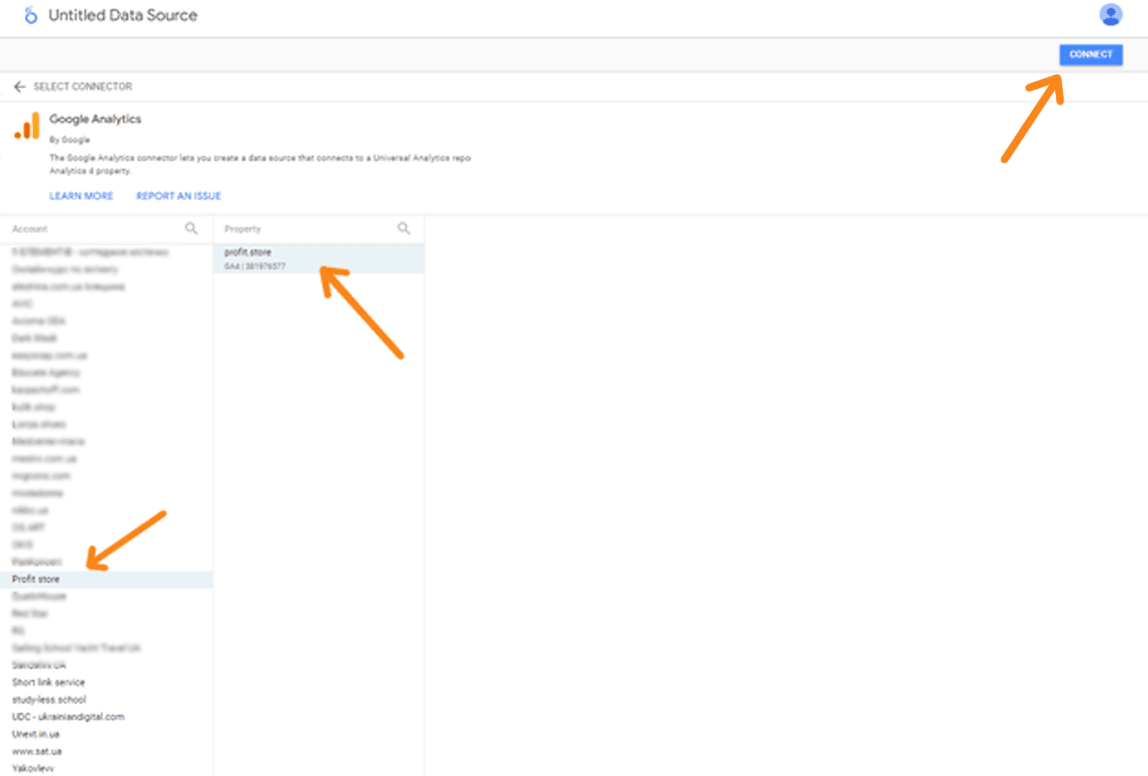
(Set up the source and click on "Link")
The next step is to configure the parameters and indicators that we want to include in the report. To remove unnecessary indicators, simply click on the three dots next to their names and select the "Hide" option. Also at this stage, you can change the format of each field, setting it as text, number, date, etc., and add descriptions if necessary.
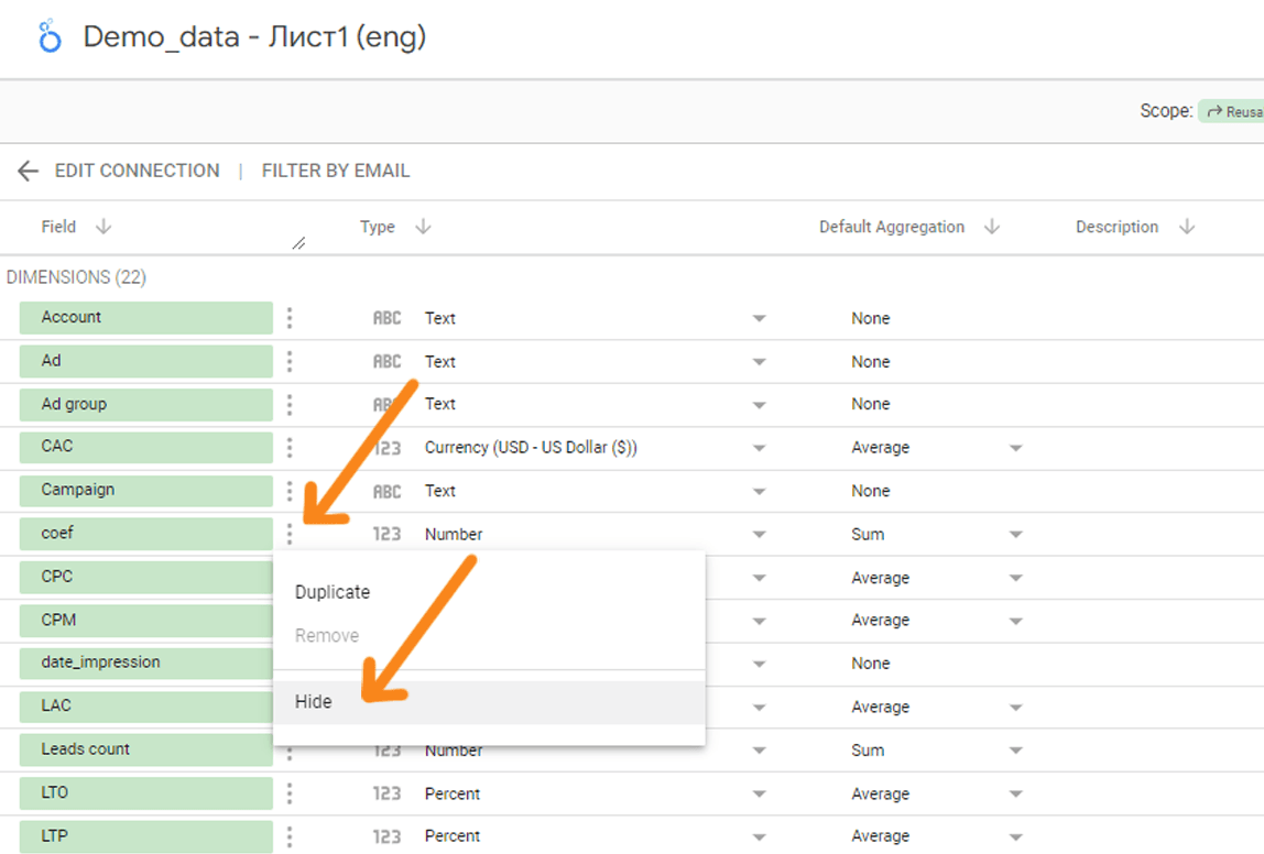
(At this point you can create calculated fields if we need to calculate metrics that are not in the original report. But we'll move on and come back to this later)
Once you're done with the settings, go to the 'Generate Report' button in the top right hand corner. After clicking this button, a blank report sheet will open in a new tab with the data source already connected.
(You may also see the Add data to report dialogue box - click Add to report and continue editing)
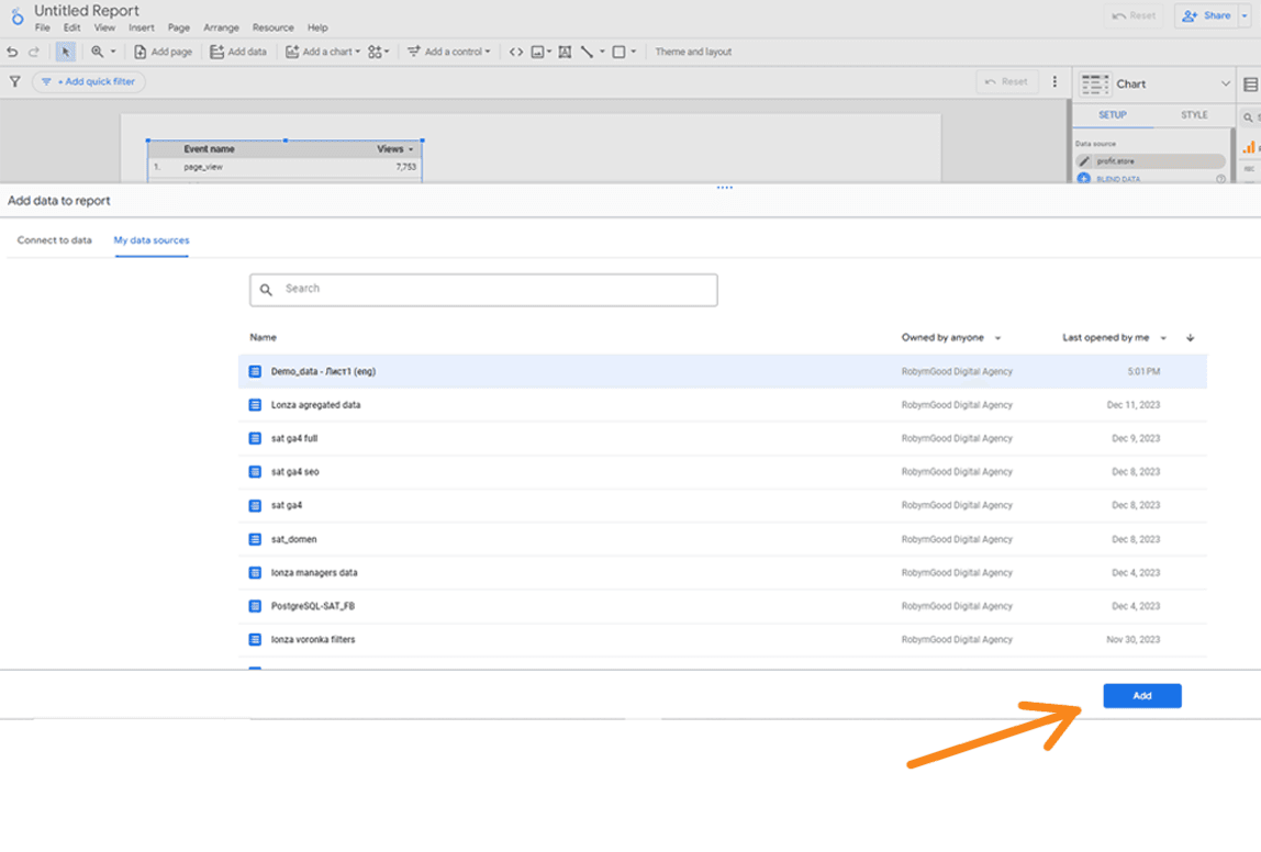
You can add a new data source to an existing report. To do this, click the 'Add Data' toolbar button and follow the algorithm above.
(Third and subsequent data sources are also included in the report)
In addition to the ability to connect to existing connectors, Google Looker (formerly Data Studio) also offers the ability to create your own open source script. This feature is primarily intended for advanced users who need to implement complex solutions for which no existing connectors exist. However, for most marketing reports, the connectors in the catalogue will be sufficient, so we won't go into detail on this aspect. However, if you are interested in this option, you can read the Google Looker (formerly Data Studio) guide to learn more about creating and working with your own scripts.
(Creating your own connector requires knowledge and skills in working with code)
Working with report entities
All elements in a Google Looker (formerly Data Studio) report are divided into three groups:
- visualisation elements;
- control elements;
- design elements.
РLet's take a closer look at each of them.
Working with graphs and tables
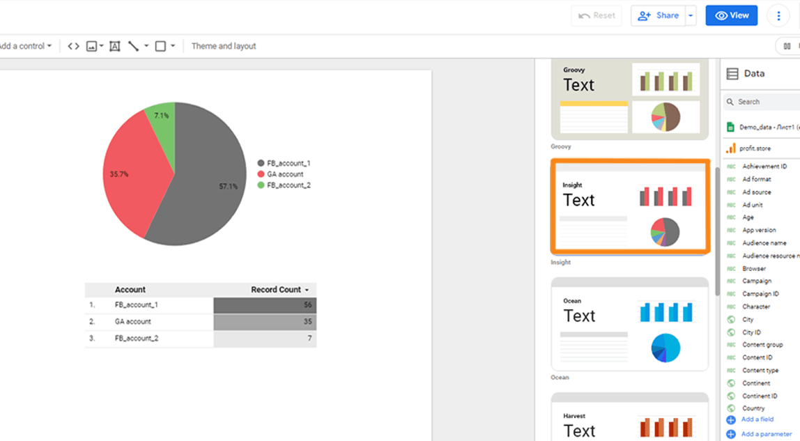
There are 14 types of data visualisation elements in Google Looker (formerly Data Studio):
- table;
- scorecard;
- time series;
- bar;
- pie;
- Google Maps;
- Geochart;
- line;
- area;
- point chart;
- summary table;
- labelled diagram;
- tree map;
- sankey;
- counter;
- cascades.
Almost every type has several varieties. The histogram has 6 of them.
The choice of visualisation element depends on the nature of the data and the purpose of the analysis. If you need to analyse numerical indicators by a single parameter, a table may be the best solution. This is particularly useful when analysing advertising campaigns or channels, for example, where it's important to compare metrics such as impressions, clicks, CTR, CPC and conversions. However, you can also consider using other types of visualisation, such as a columnar table or a heatmap in Google Looker (formerly Data Studio), to improve the visibility of the information.
A line chart is a great tool for visualising and tracking changes in one or two indicators over time. Typically, the x-axis shows dates such as days, months, weeks or years, depending on the level of detail required for the analysis.
A pie chart is an effective way of presenting a single indicator in the context of a single parameter. For example, you can illustrate data such as traffic from different sources, social media followers by city, clicks, leads or conversion rates by gender and age.
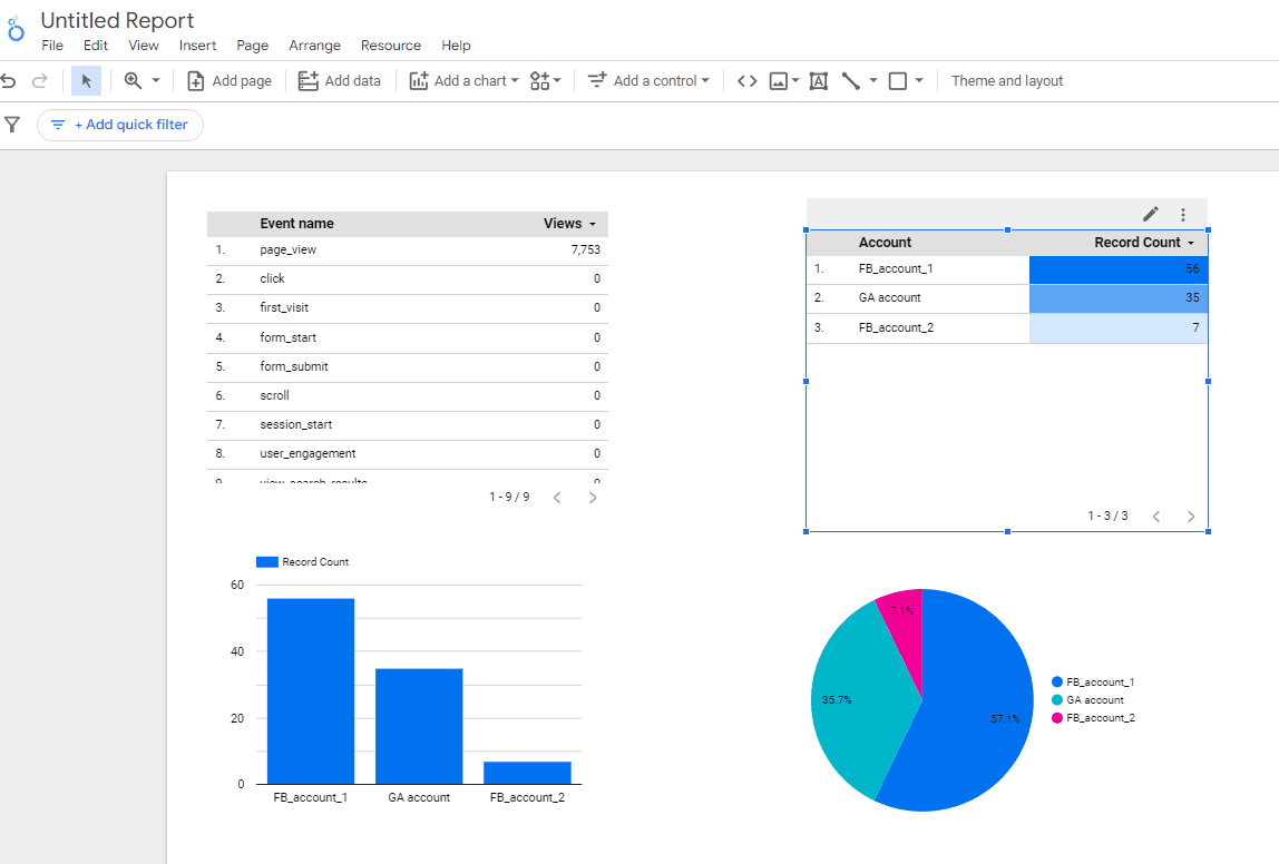
(Normal table, heat map table, time series line chart and pie chart in Google Looker (formerly Data Studio))
Adding graphs and charts
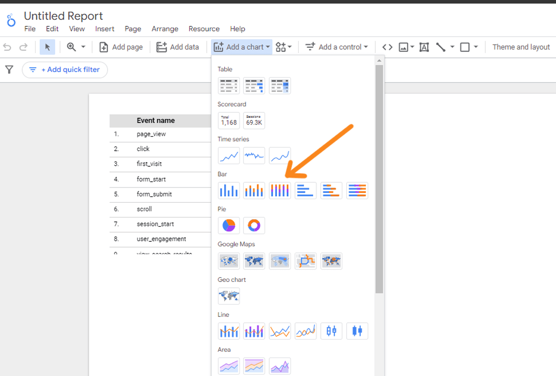
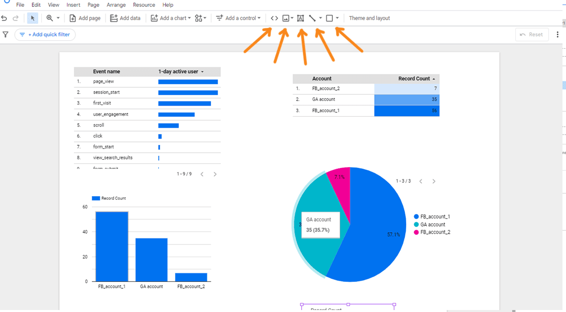
All visualisation elements in Google Lookup are added in the same way - using the Add Chart button on the toolbar.
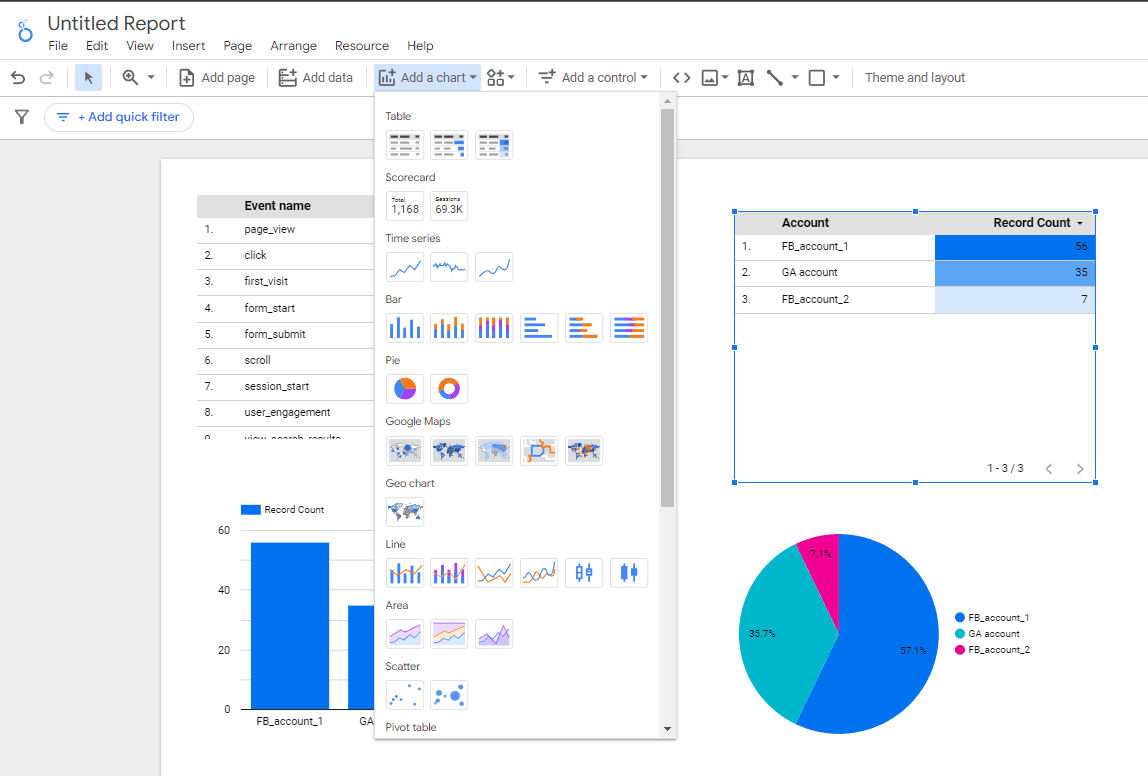
(Select an item from the drop down list)
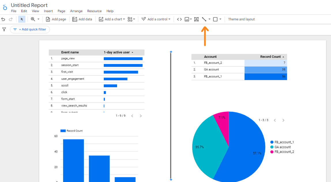
Once you have selected the graph you require, you can use the left mouse button to paste it into the appropriate place on the report sheet. You can then drag, resize and copy the graph, including the ability to place it on other pages of the report. Right-clicking on a graph element allows you to perform actions such as move forward/backward, move to a report level, cut, copy, delete and more.
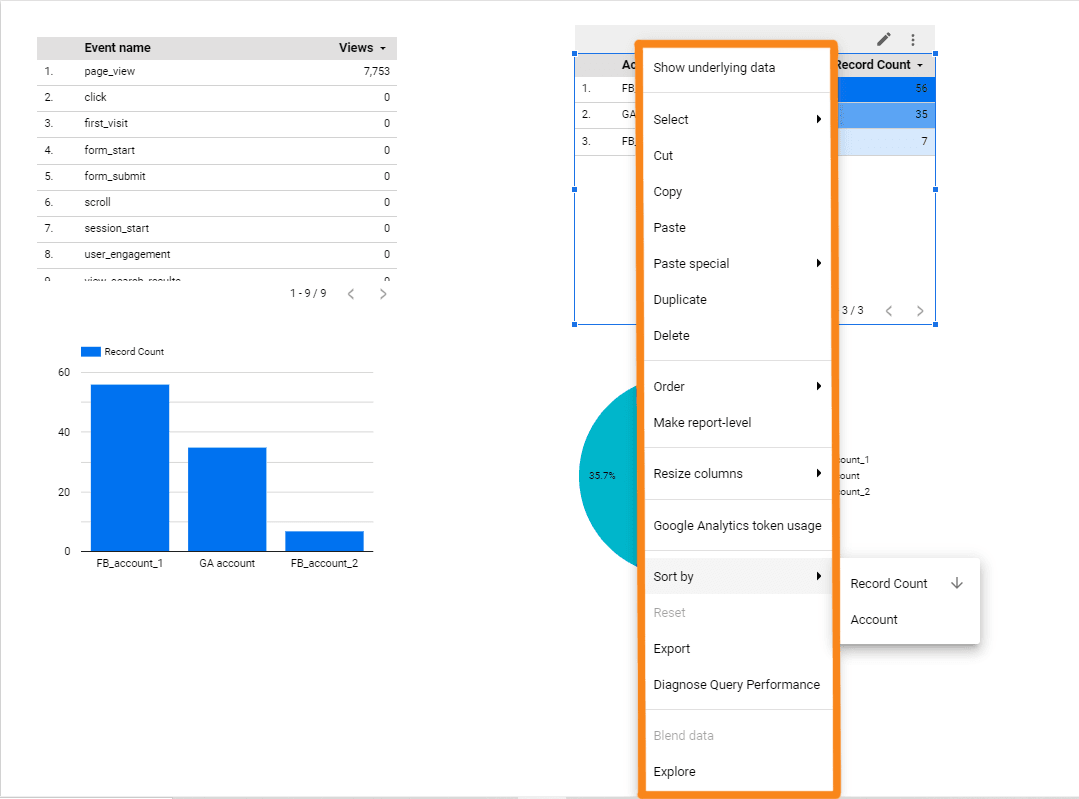
(Available table actions)
If you make a mistake and add the wrong item, you don't have to delete it immediately. You can change the table type by clicking the down arrow next to the table name in the right pane. This will bring up a list of available items.
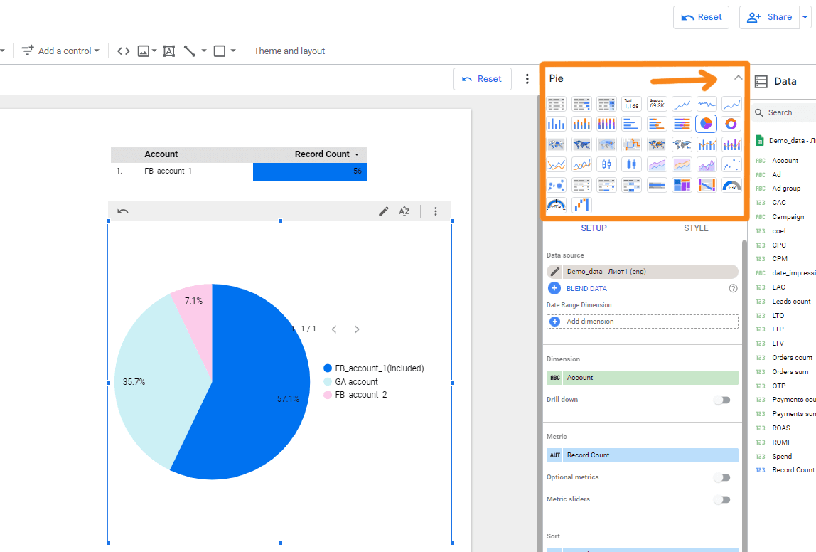
(Select the one you want and go to settings)
Working with third-party visualisations
In addition to the built-in charts in Google Looker (formerly Data Studio), you can also use third-party charts created by developers. These third-party charts can be added using the Third-party visualisations and components menu, located to the right of Add Chart. To see all available third-party visualisations, simply click on this item and click 'More'.
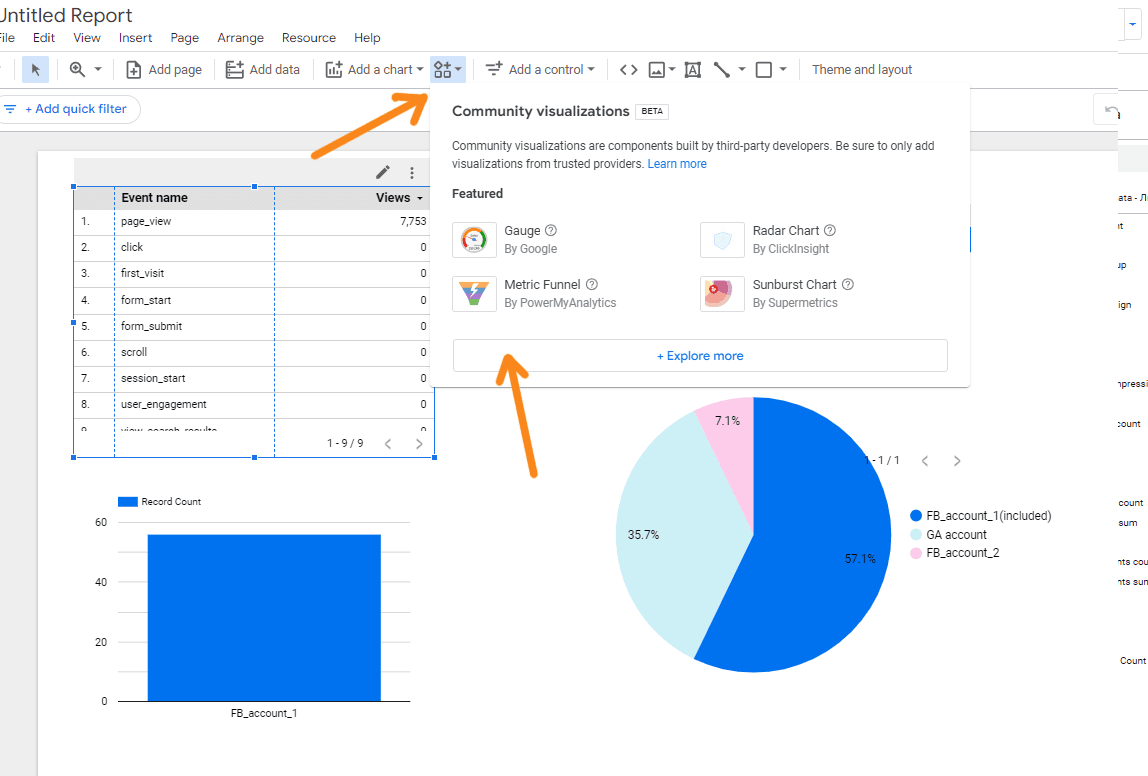
(Open the catalogue of third-party visualisations in Google Looker (formerly Data Studio))
To view the available third-party visualisations, you can click on the 'Third party visualisations and components' menu item and open the list. You may then need to grant permission to use a third-party visualisation. To see what the item looks like, click on the three dots on the map and select 'Details'.
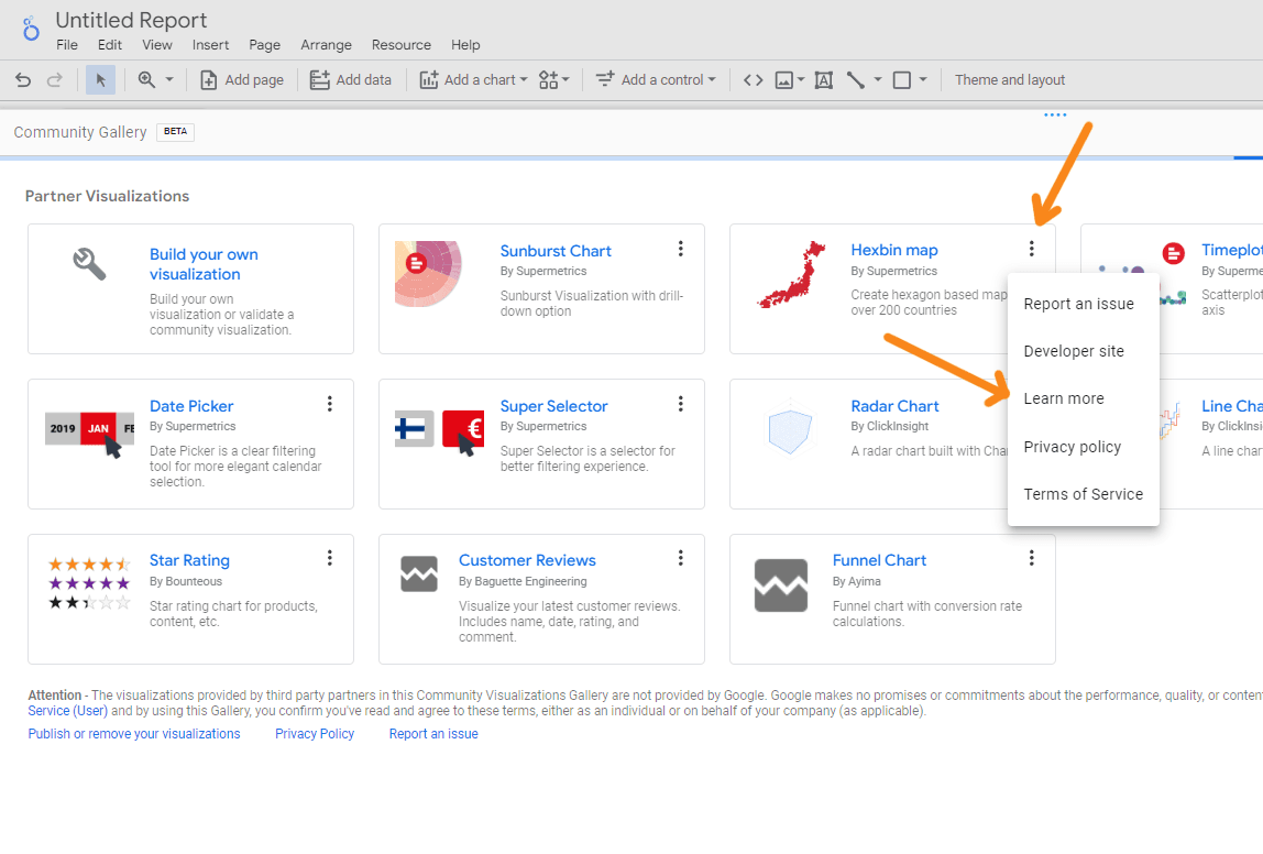
(To return to the report, click 'Close' in the top right-hand corner)
Setting up data display in Google Looker (formerly Data Studio)
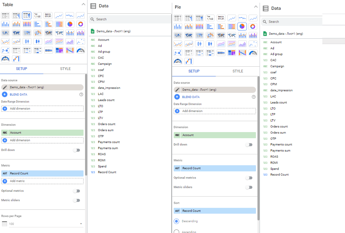
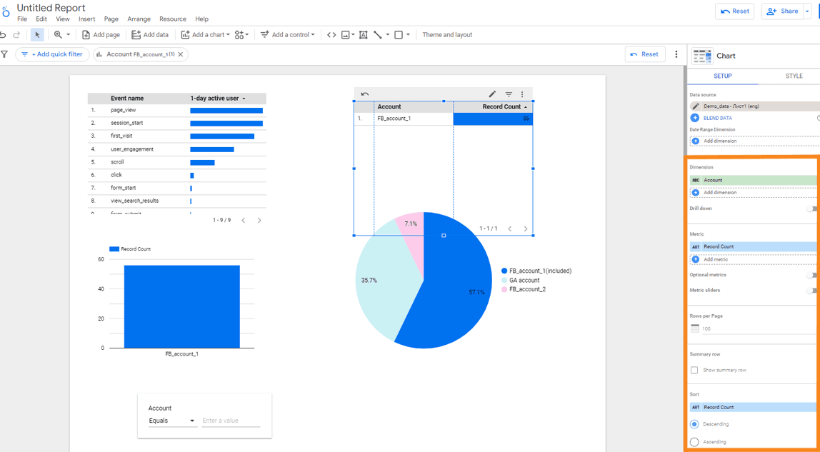
Once you have added a table or graph to your report, you will need to configure it. In the Data tab of the right pane, specify
- Data source - relevant if there is more than one. A single data source is specified by default.
- Data analysis parameters: date, website page, advertising campaign, traffic source or channel, etc.
- Indicator - one or more metrics you want to display: new users, sessions, bounce rate, cost per click, etc.
- Sort - the indicator by which you want to sort the data.
If you use multiple data sources in your report, you can add data from different sources to a single sheet for a more objective analysis. For example, you can compare data from Google Analytics on the same sheet, or create a summary that shows the number of leads from different channels and traffic sources.
This is the minimum required to produce a clear and informative graph.
Other parameters may vary depending on the object. For a table, for example, these might include
- The number of lines on the page.
- A string with the total values.
- Default and comparison date ranges.
- Additional indicators and sorting.
- Sliders for setting up indicators.
The last option allows you to activate an interactive element that allows you to filter table rows in view mode, selecting those that meet certain criteria, for example a certain range of indicator values.
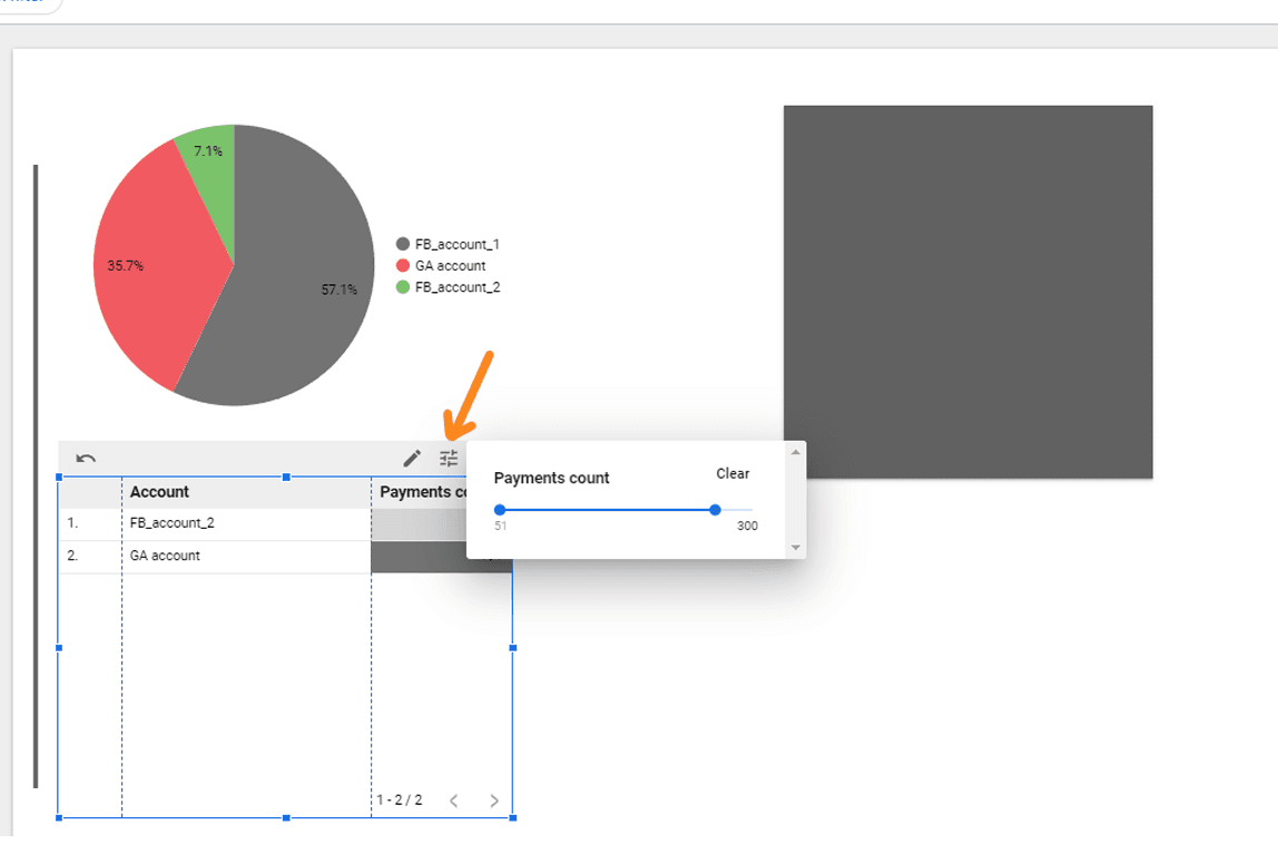
(This is how the indicator sliders look in view mode)
Examples of settings for other items:
(Setting up the data display for PivotTable, Summary, Google Map, and Area Chart)
Creating filters for tables and graphs
You can create a filter for any data visualisation element in Google Looker (formerly known as Data Studio). This option is useful when we want to analyse a graph with a limited amount of data selected by a particular criterion. For example, we can create a table to show the performance of blog pages and only show the traffic coming from search engines. Or we can filter the data to show only information about advertising campaigns that did not achieve any conversions.
To create such a filter, follow these steps
- In Google Looker, on the Data tab, click Add Filter in the settings of the item you want to filter.
- If you have previously created filters in this report, a list of filters will appear in the window. To add a new filter, click Create Filter at the bottom of the window.
- If this is your first attempt at creating a filter, the filter configuration interface will open immediately.
- In this interface, specify the name of the filter and select the data source if you have more than one.
Once these parameters have been set, you can configure specific filter conditions that determine how the data is displayed in your visualisation.
Set the condition:
- Select whether to include or exclude data in the report based on a specified condition.
- In the list, find the parameter/indicator by which we want to filter the data.
- Set the condition: "Equals", "Begins with", "Contains", etc.
- Enter the value at which the filter is to be triggered.
- Save the changes and immediately see the results of applying the filter in the report.
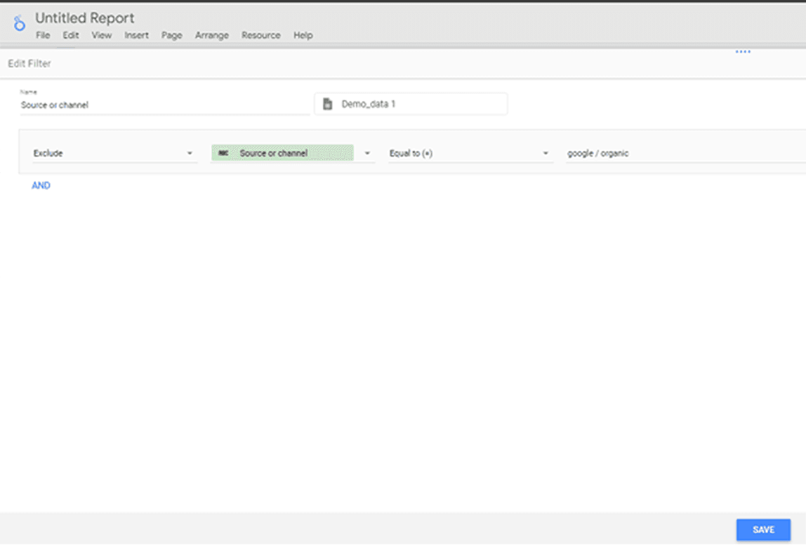
(Example of setting up a filter on a table in Google Looker (formerly Data Studio))
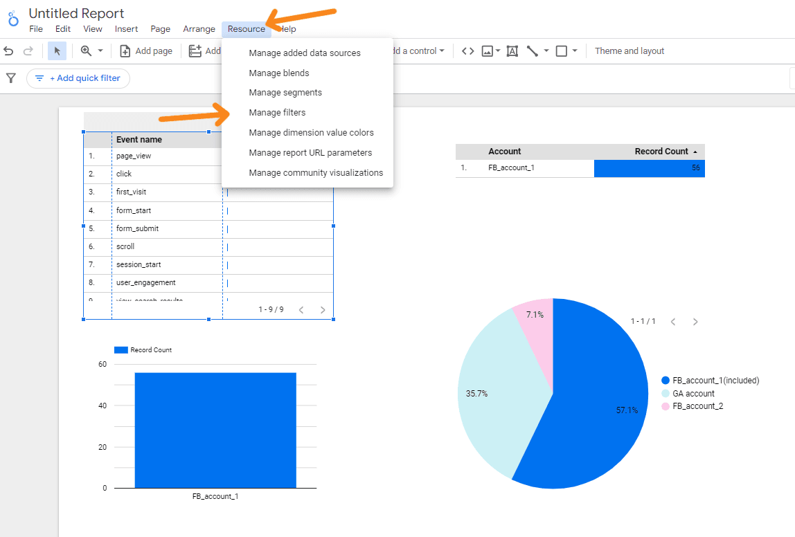
If you need to change or delete filters, open the Resource → Customise Filters menu.
(За кліком відкриється список фільтрів із можливістю їх скопіювати, змінити та видалити)
Calculating calculated metrics in Google Looker (formerly Data Studio)
"Custom Fields is another very useful and advanced feature in Google Looker (formerly Data Studio) that can be found in the Data pane in the settings of a visualisation element. It allows you to add parameters and metrics to your report that are not available in the original data source by calculating them based on the available data.
For example, you can calculate the conversion to lead for paid traffic channels by dividing the number of leads by the number of users.
To add a custom field, click Add parameter or Add indicator and select Create field.
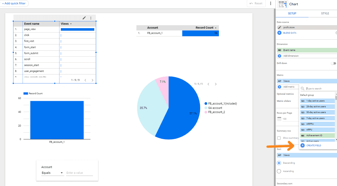
In the window that opens, enter the name of the indicator and the formula, select the type and click Apply.
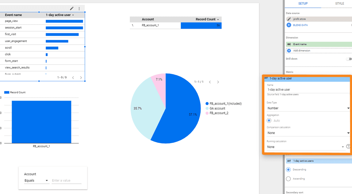
(The new indicator will appear on the chart. You can then use it in other elements of the dashboard)
In addition to simple arithmetic operations, Google Looker (formerly Data Studio) supports logical, textual and other functions. The full list of available formulas with syntax is available in the Google Looker help. (https://support.google.com/looker-studio/table/6379764?hl=en)
Creating charts with combined data
In the Data pane of Google Looker (formerly Data Studio), you can set up data merges. This feature allows you to use information from different sources in a single report, graph or table. You can merge up to 5 data sources. This is particularly useful when you need to combine disparate data to build an end-to-end analysis system.
For example, if you have customer data in Google Analytics and data in a CRM system, you can display them in one table and combine lead data with sales and profit figures.
But there's a catch. In order to combine two sources, you need a merge key - an indicator that exists in both. In the case of Google Analytics and CRM, this can be a UTM parameter.
Customise the appearance of tables and graphs
The Style tab in the right pane contains tools for customising the appearance of a visualisation element. These are slightly different for different tables and charts.
For a simple table, you can set this here:
- colour, size and font of headings and labels;
- line colours;
- colours, thickness and style of lines;
- footer style;
- align the contents of columns;
- background and borders;
- display and colour of the chart title;
- additional conditional formatting, etc..
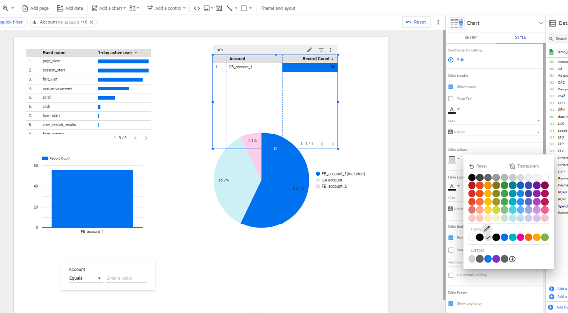
(Setting the appearance of a table in Google Looker (formerly Data Studio))
Working with filters and controls
Controls help you turn static reports into interactive dashboards. In view mode, you can switch between different time periods and data slices.
In total, there are 8 controls available in Google Looker (formerly Data Studio):
- drop-down list;
- a list of a fixed size;
- input field;
- advanced filter;
- slider bar;
- checkbox;
- date range;
- data management.
The first 6 are filters that apply to all elements on the report page and allow you to switch between slices. For example, we can filter the data on the page by ad campaign, traffic source and device type.
The date range allows you to view data for different time periods and the data management tool allows users to add data from available sources to the report in view mode.
All controls are added using the appropriate toolbar item.
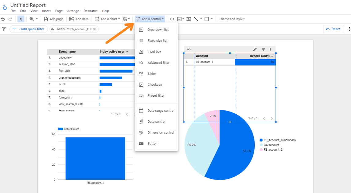
(Expand and select the desired one from the list)
For the controls, there is also a right panel with the Data and Style tabs. The second is clear - you can set fonts, colours, backgrounds and borders. On the first, the settings are different for each type. For the Date range element, you can choose a default period or leave it automatic, and for the drop-down list, you can specify a parameter and an indicator, set the order of the items in the list and specify the default date range. You can also add a filter, just as you can for graphs and tables.
For controls, you can also access the right settings panel, which includes the Data and Style tabs. The Style tab allows you to set fonts, colours, backgrounds and borders.
The first tab, Data, has different settings for each element type. For example, for the Date Range element, you can choose a default period or leave it in automatic mode. For the drop down list, you can set parameters and indicators, specify the order of items in the list and set the default date range. You can also add a filter, similar to graphs and tables.
(Setting the data display for the dropdown list element)
You can also interact with these elements at the interface level. You can drag, resize and copy them. To do this, right-click to access additional options: cut, copy, delete or reposition the element. If you select the Move to report level option, the element will appear on all pages of the report.
(For large reports, it is useful to set a date range once for all pages at once)
Working with images, shapes, text
The final component, design elements, is used to add additional information and visual elements to the report, such as explanations and titles for graphs, inserting logos and screenshots, and additional design elements. These additions make the dashboard more informative, expressive and visually appealing. In addition, this element is used for branding and providing customers with corporate identity.
There is a block of icons on the Google Looker (formerly Data Studio) toolbar to add controls:
- URL of the embedded element.
- Images - can be uploaded from your computer or added via the link.
- Text.
- Lines - line, arrow, angle connector and curved connector.
- Shape - rectangle and circle.
(By clicking on the icon, a list with a selection of a specific element drops down)
Each object also has a settings panel on the right, and these settings may differ for different types of objects. For example, in the Data tab, you can specify a link for an image, and in the Style section, you can adjust options such as background, borders, and shadow. For text, lines, and shapes, there is no Data tab. The text style settings are almost identical to the Simple Editor.
(Here is an example of how to set up rows)
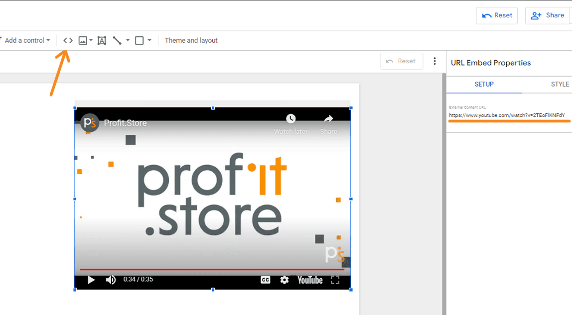
Of course, you can also add third-party content to your report using embedded elements, such as a URL, YouTube video, etc. To do this, select the appropriate tool in the top bar, click on the desired location in the report and copy the link to the item into the field on the right. The item will appear in the report.
(You can set the style and borders in the Style tab)
Customise the appearance of the report
You can set the appearance of any element, whether it's a graph, text or line. However, setting the style separately for each report can be time consuming. The good thing about Google Looker (formerly Data Studio) is that you can set all these settings for the whole report at once.
Every element, whether it's a graph, text or line, can be customised in terms of appearance. However, it can be time-consuming to set the style for each element individually. In Google Looker (formerly Data Studio), however, you can apply these settings to the entire report at once.
To access customisation, click Theme & Template in the toolbar.
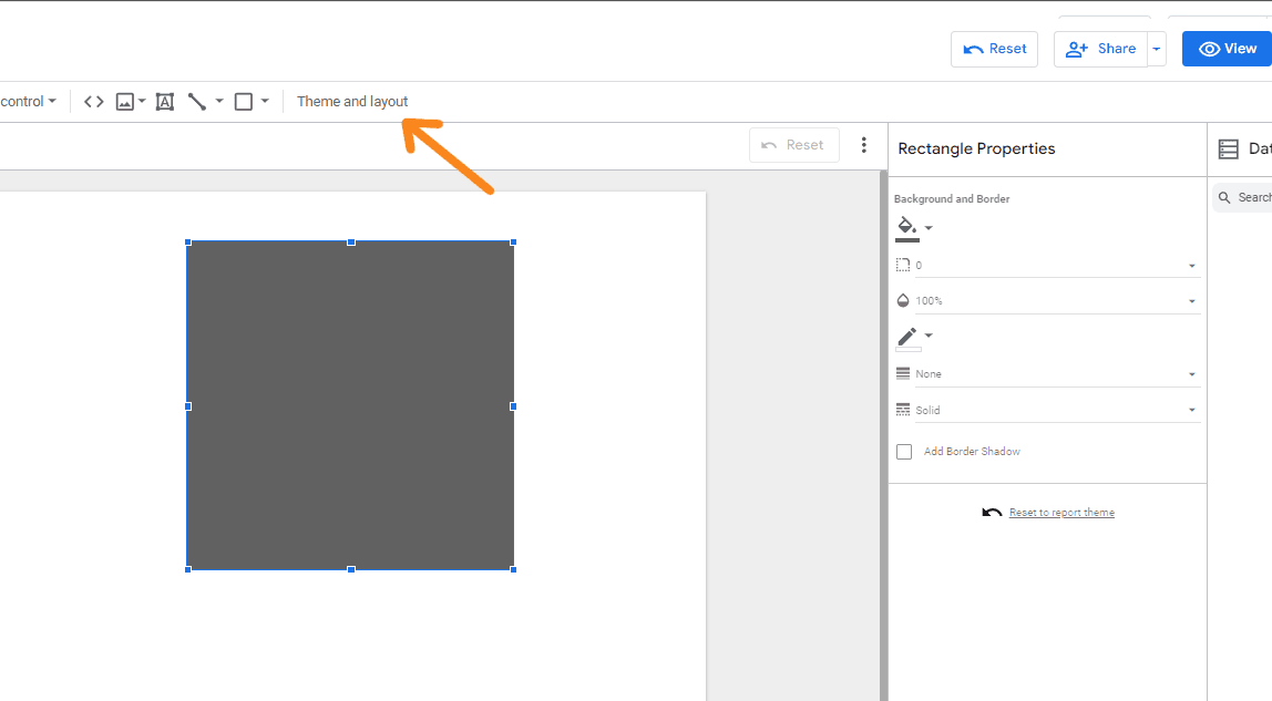
(Click on the right pane to open the settings)
Google Looker (formerly Data Studio) has two ways to set the style for the whole report:
- Choosing a ready-made theme is faster, but without individuality.
- Customise the pre-made template by clicking the 'Customise' button at the top of the panel.
(Clicking on it opens a group of settings for colours, fonts, borders for different report elements of the same type)
The Layout tab allows us to change the visibility of the header, the navigation type, the canvas size, the display mode, the margins, the grid and the smart guides.
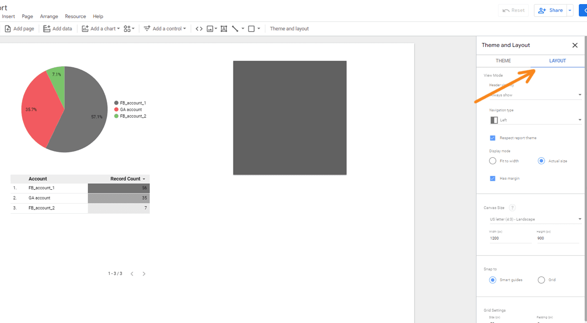
(These settings also apply to all report sheets)
Saving and viewing results
In Google Looker (formerly Data Studio), just like in Google Docs and Sheets, you don't have to save data manually. All changes are saved automatically and a version history is available. This makes it easy to keep track of changes, and if you make a mistake, you can roll back to a previous version.
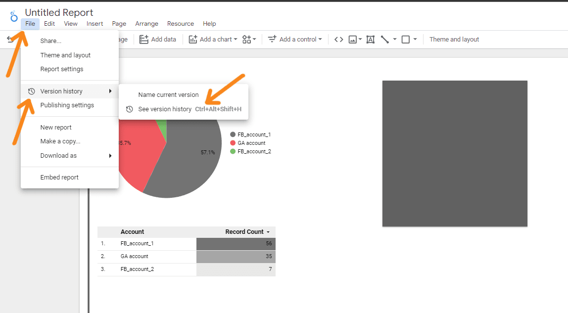
(Opening the version history in Google Looker (formerly Data Studio))
You can toggle between edit and view mode using the blue button in the top panel.
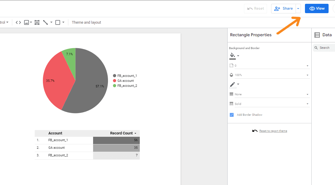
(In view mode, it is called Edit)
Setting up report sharing and export
One of the key benefits of Google Looker (formerly Data Studio) is the ability to provide different levels of access when sharing reports online. You can open up access to a dashboard for your colleagues to edit, allowing them to add their own graphs and settings. You can also share the report with your clients so they can view it without being able to make any changes.
You can share the file with other users in a number of ways:
- Invite to a Gmail address with view or edit access.
- Set up an email campaign with a specified frequency.
- Share the link in the same way you share links on other Google services.
- Embed in a web page using html code or a link.
- Download in PDF format and send or print by any means.
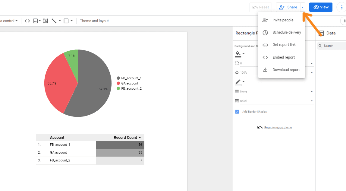
(To select a method, click the arrow next to the Grant access button)
Basic hotkeys for working with reports:
- Copy - Ctrl + С.
- Paste - Ctrl + V.
- Delete - Delete.
- Open version history - Ctrl + Alt + Shift + H.
- Group - Ctrl + G.
- Ungroup - Ctrl + Shift + G.
- Add a page - Ctrl + M.
- Move up - Ctrl + Shift + ↑.
- Move down - Ctrl + Shift + ↓.
- Update your data - Ctrl + Shift +E.
- Cancel - Ctrl + Z.
- Repeat - Ctrl +Y.
- Cut - Ctrl +X.
- Create a copy - Ctrl +D.
- Select all - Ctrl + A.
Google Looker (formerly Data Studio) templates
Google Looker (formerly Data Studio) templates are pre-built reports with demo data that you can easily copy and connect to your sources. They save you a lot of time because you don't have to build reports from scratch. You can choose a template that partially meets your project goals and objectives, and quickly customise it to meet your needs.
You can access the template gallery from the main page of the service by clicking on the relevant item in the side menu or the arrow in the template block.
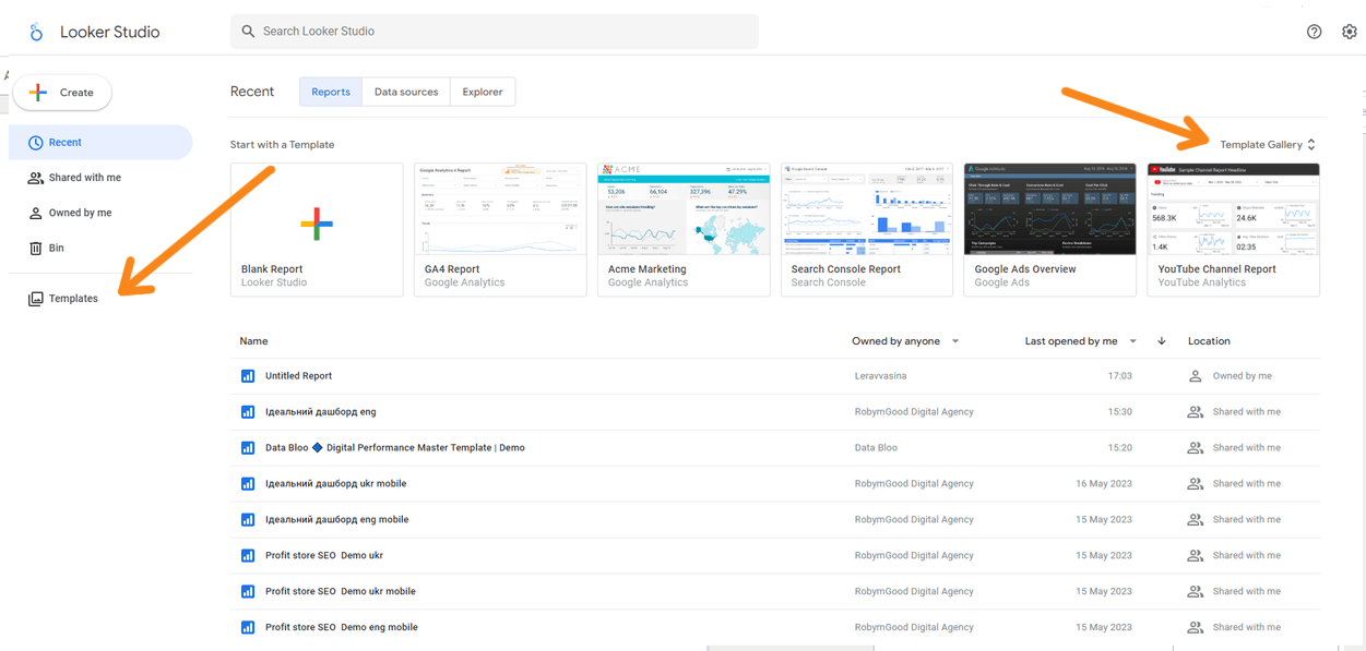
(Open the gallery of Google Looker (formerly Data Studio) templates)
All templates in the catalogue are grouped into categories according to the types of data sources they use:
- Google Analytics;
- Bigquery;
- Google Tables;
- YouTube Analytics;
- Google Ads, etc..
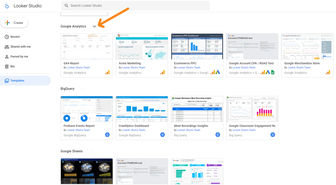
(Click the arrow next to the name of the data source to see all the templates for it)
To use a template, click on it, wait for it to load and then click 'Use template'.
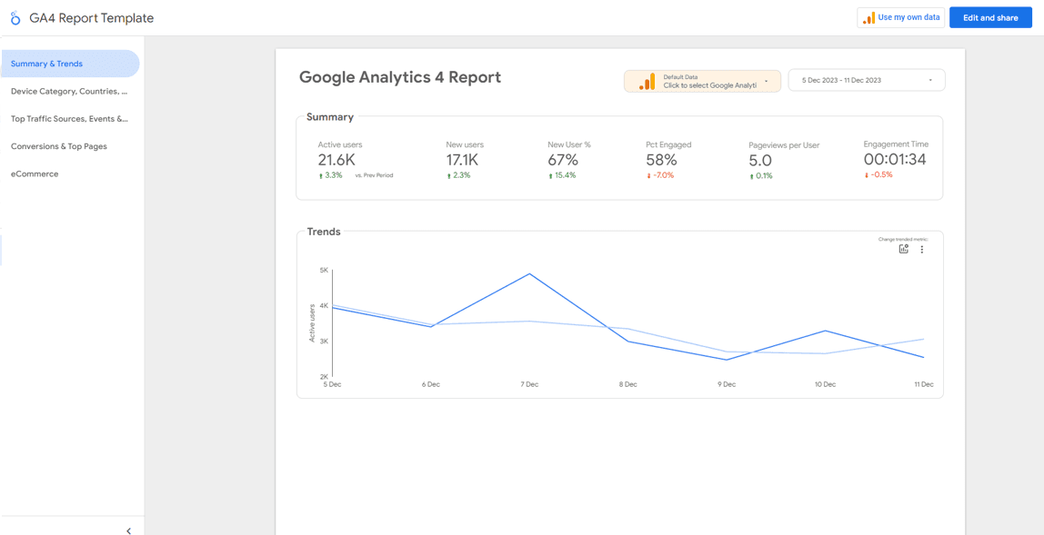
(Start creating a report in Google Looker (formerly Data Studio) from a template)
In the pop-up window, select the data source you want to use and click Copy Report.
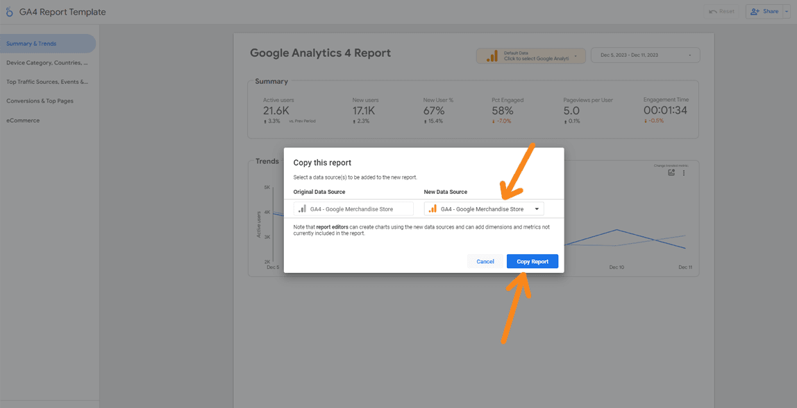
(The template will open in edit mode with the source attached when you click on it)
Of course, you can then edit and delete individual elements, change the appearance and display options, create filters and generally perform all the same actions as when creating a report from scratch.
In conclusion, it's important to note that Google Looker (formerly Data Studio) is a powerful, convenient, but not so simple tool. If you want to create attractive, informative and interactive reports, you'll need to invest some time in learning how to use it.
SHARE

OTHER ARTICLES BY THIS AUTHOR
Get the most exciting news first!
Expert articles, interviews with entrepreneurs and CEOs, research, analytics, and service reviews: be up to date with business and technology news and trends. Subscribe to the newsletter!
By clicking “Subscribe” you agree to Privacy Policy and consent using your contact data for newsletter purposes
OR FOLLOW ON:
