


What is Tableau and why do analysts need it?

TABLE OF CONTENTS
Profit.Store

27
Why do analysts need BI tools when they have code? Let's analyse the pros and cons of one of the most popular systems and show what it can do.
Data visualisation helps to communicate results to colleagues, managers or a non-technical audience. That's why analysts often create charts and prepare presentations. This doesn't always require additional software - many programming languages, such as Python, have visualisation tools.
This method is not suitable when an analyst or developer needs to visualise the result for people who do not understand the code. This is where BI systems come in. They help to analyse data and create graphs with little or no programming.
One of the most popular BI systems is Tableau. It regularly receives high user ratings and is used in many international companies. This tool is often tested in job interviews, so it is important for analysts and managers to know its main features and parameters.
Tableau is an Interactive Business Intelligence (BI) System
Tableau is an interactive analytics system that enables you to quickly perform deep and comprehensive analysis of large amounts of information without requiring business user training or expensive implementation.
Tableau can interact with cloud-based solutions (Dropbox, Google Sheets, AWS Redshift, etc.) as well as modern data analysis tools such as Python and R.
Who needs Tableau and why?
Tableau is required:
-
Product analysts to create dashboards of business metrics for colleagues: from product and marketing teams to engineers and top management.
-
Analysts to create charts and present research. Tableau is also used for data analysis, basic calculations and forecasting.
-
Managers and executives to create charts and presentations without code in an easy-to-use interface.
Tableau features
Tableau has many visualisation and analysis tools. For example, to find anomalies and patterns in data or calculate business metrics over time.
What the service can do
-
Collect and combine data from multiple sources - whether it's an Excel spreadsheet or a database. Tableau can combine data from multiple spreadsheets into one in a variety of ways.
-
Manipulate and transform data. The service helps you group and filter data, add calculations and create pivot tables for reports. Such processing helps prepare data for visualisation so that the charts in Tableau are of higher quality.
-
Create charts - from simple pie and bar charts to detailed maps. You can also add help elements and tooltips to your visualisations.
-
Make predictions. Tableau helps you solve simple machine learning tasks such as finding trends, making predictions, and segmenting data.
-
Create interactive dashboards and presentations. Dashboards can be used to present research and give colleagues access to the data they need. Visualisations and dashboards can be interactive - when users control the information displayed on them. For example, they can select the time period they want, so the charts only show data for May of the current year.
-
Work with projects on a local computer or in the cloud. The desktop versions of Tableau Desktop for Windows and Mac and the cloud version of Tableau Cloud are paid applications. There is also a free version, Tableau Public, which has a number of limitations. For example, you can't work with databases and save the results to your computer. However, it does allow you to create high-quality visualisations and even build a portfolio. You can publish them on the Tableau Public server.
Pros and cons of Tableau
Tableau skills are often required for analyst, data engineer and developer roles. It's a useful tool for business, but there are some drawbacks.
| Pros |
|---|

|
|
|
|
|
|
|
| Cons |
|---|

|
|
|
|
|
Tableau Editions
The Tableau ecosystem includes multiple versions of the core platform:
-
**Desktop is a data analysis and visualisation tool. It allows you to quickly connect to any data source in your organisation, create beautiful graphs and visualisations, and set up a high quality interactive dashboard.
-
Server is a website that allows you to share reports created in Tableau Desktop with colleagues. It is a great tool for creating enterprise-level dashboards and reports. The server can connect directly to data sources so you can create interactive visualisations right in your browser.
-
Online is a cloud-based solution for working with data and reports from a browser or mobile application anywhere in the world.
There are also additional services that extend the capabilities of the main platform:
- Prep is an additional application for preparing (extracting, processing, loading) data for analysis and setting up scenarios for future research.
- CRM - Tableau and Salesforce CRM integration for rapid data analysis in the enterprise workflow.
- Public is a free service for creating interactive visualisations and publishing them to websites, blogs and portfolios.
- Data Management is a module that allows you to find, prepare and organise data.
- Server Management is a service that simplifies the deployment of critical server solutions. It ensures their security and scalability.
Tableau's functionality is particularly effective when you need it:
- Dashboards with access to an existing data warehouse (DWH/DataWareHouse) or SSAS multi-dimensional cubes.
- Tools to enable business users to create their own dashboards and analyses.
- Ability to use MS Excel/Tableau with data from SSAS Cubes/Microsoft/SQL Server data as end solutions.
- Easily visualise existing Excel PowerPivot databases.
- Web interfaces for dashboards and analytical applications.
- Send analysis views to other users on request.
How to use Tableau
For example, an analyst at a computer game company is studying data on game sales and wants to prepare a report for colleagues. He gathers information on which regions are more likely to buy games, which genres and which developers are in demand. He wants to visualise the results of his research in Tableau and compile the resulting graphs into a dashboard.
First you need to install Tableau. You can download Tableau Desktop from the official website. The software has a 14-day trial period from the time of installation. Another option is to use the free version of Tableau Public. It has all the basic features of the tool.
Once Tableau is installed, you are ready to get started:
-
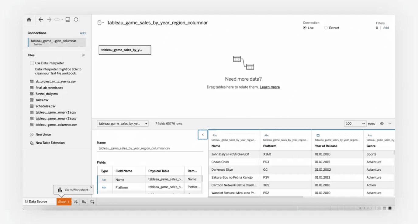
On the home page, the analyst uploads data. This can be an Excel spreadsheet, a database, a text file or a PDF.
-
When the file is loaded, Tableau immediately displays its contents.
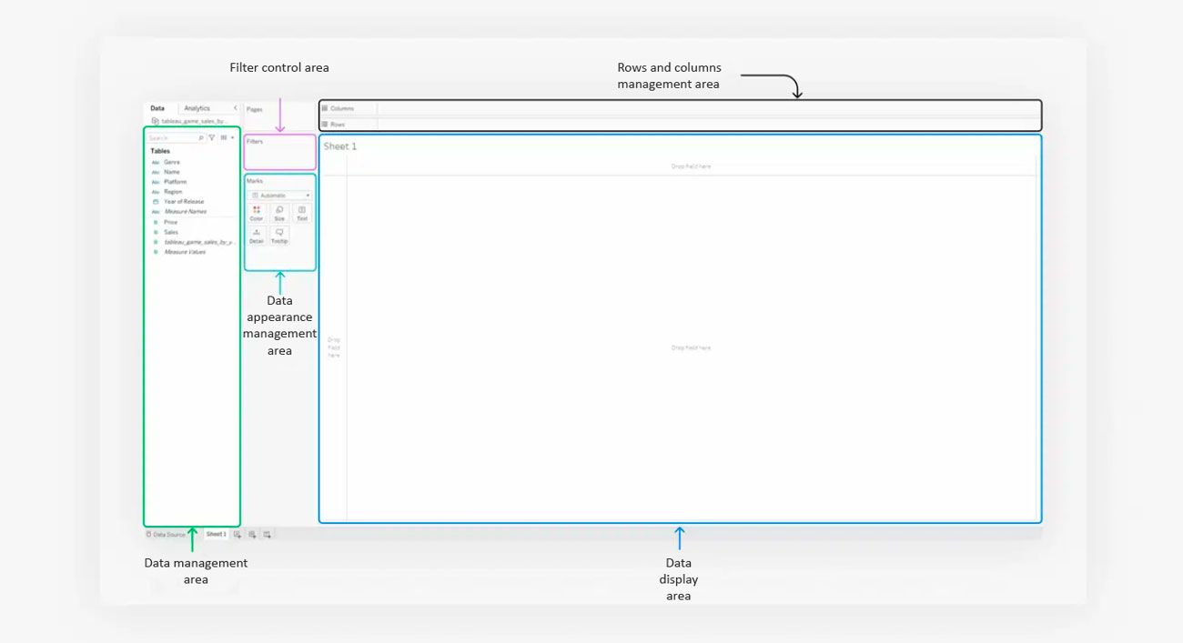
- To begin working with data and creating graphs in Tableau, open a new sheet by clicking the plus sign in the bottom left corner. Tableau will open the sheet editing screen.
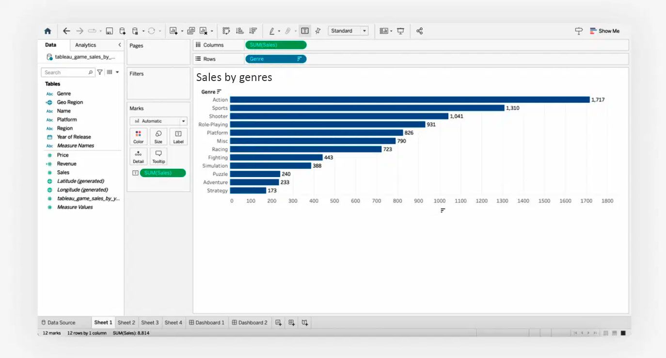
- To visualise the best-selling genres, the analyst chooses a bar chart. The rows are game genres and the columns are millions of copies sold. Data can be dragged and dropped into the desired area. Tableau suggests the appropriate chart type, and all you have to do is sort it and add labels.
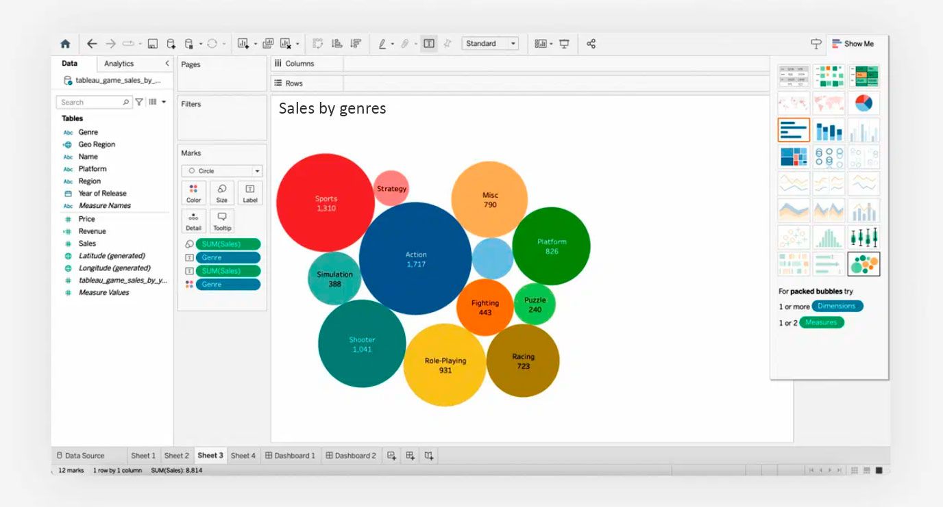
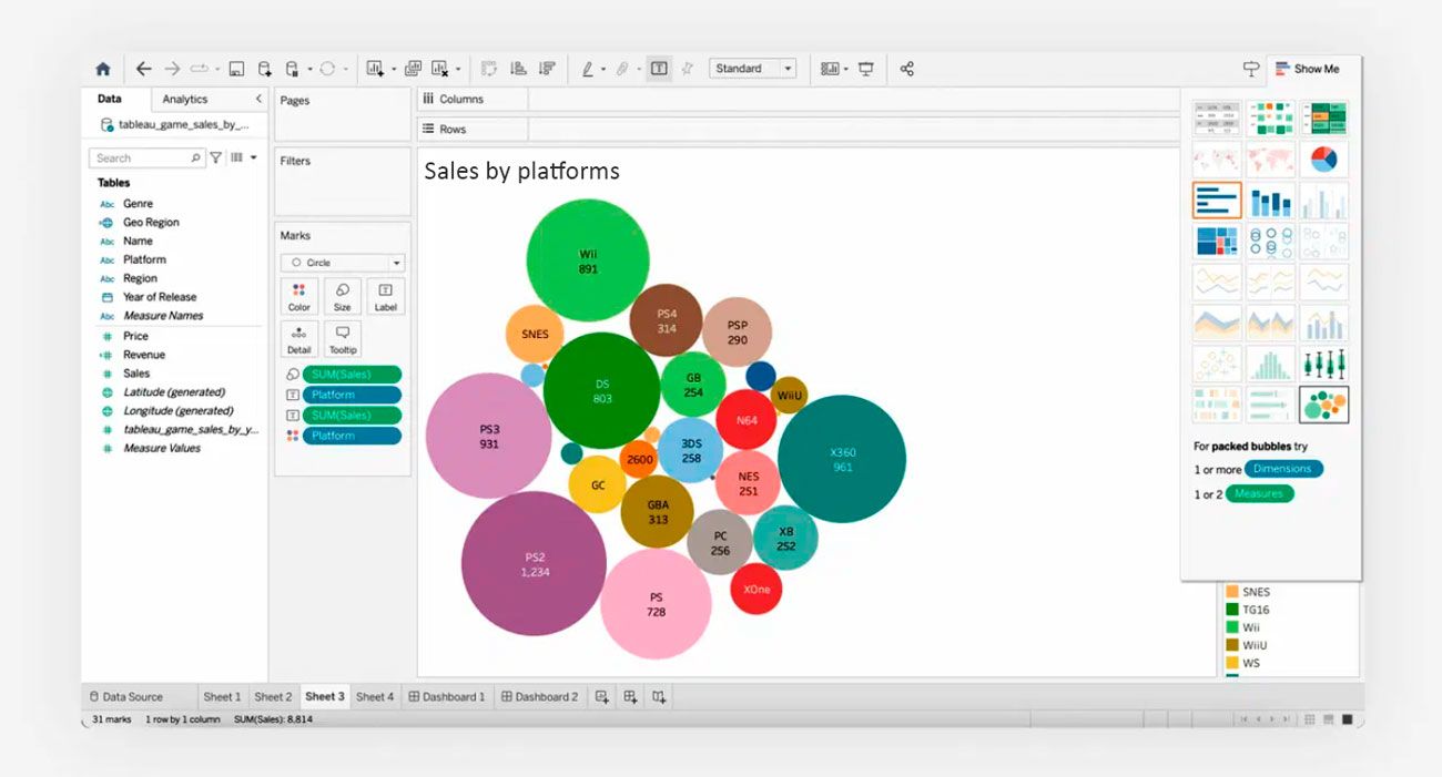
- A bubble chart can present the same information in a different way. You can choose the type of chart from the Show Me menu on the left.
- The analyst changes the data displayed: the bubble chart now shows which platforms' games are selling best.
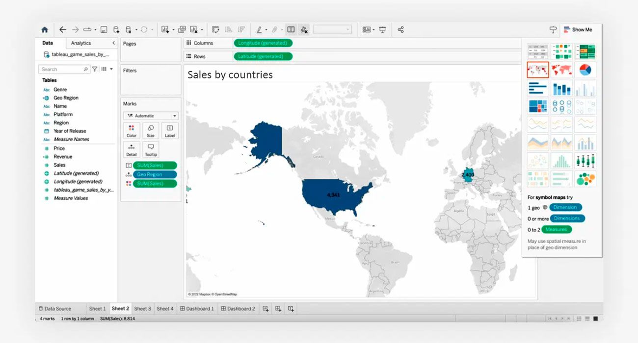
- The next graph should show sales data by country. This information is best displayed on a map. Tableau will find the geographic data on its own, but if it doesn't, you can do it manually. The service will offer to create a map and automatically highlight the outlines of the countries indicated in the data. The colour of the country on the map depends on the volume of game sales - the higher the volume, the more saturated the colour.
- From the resulting graphs in Tableau, you can create a small dashboard.
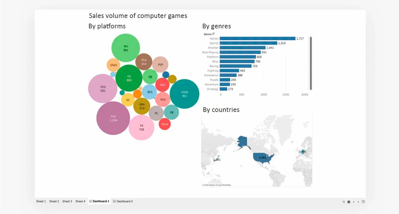
- The report is ready - colleagues are happy. For this dashboard, the analyst did not need complex tools and charts. But a big meeting with investors is coming up, and the analyst needs to make the dashboard more interactive and visual. A few hours of work and the report is ready to be shown to the investors.
Conclusion.
Tableau is a tool with a huge number of features. It's impossible to cover all the features and nuances of this tool, which is why it's so important to learn from examples. The Tableau Public website has an extensive online gallery of ready-made visualisations. Any visualisation can be copied to the cloud and analysed. For example, you can analyse how the author solved a computational problem or built a graph. Studying the inner workings of your favourite dashboards can help professionals improve their own visualisations.
SHARE

OTHER ARTICLES BY THIS AUTHOR
Get the most exciting news first!
Expert articles, interviews with entrepreneurs and CEOs, research, analytics, and service reviews: be up to date with business and technology news and trends. Subscribe to the newsletter!
By clicking “Subscribe” you agree to Privacy Policy and consent using your contact data for newsletter purposes
OR FOLLOW ON:
